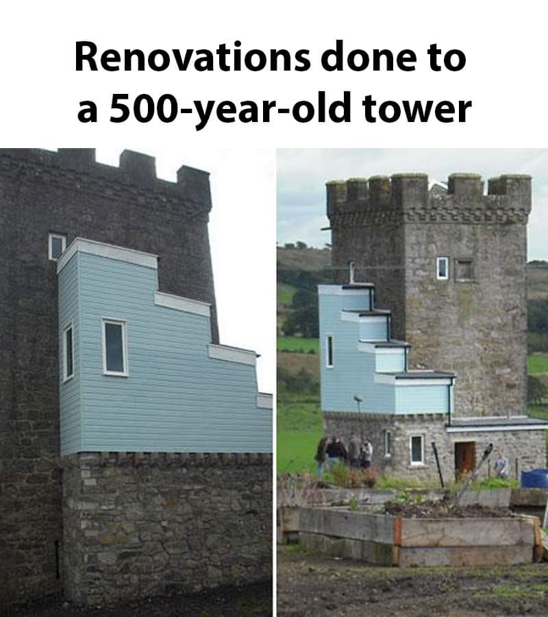
Everytime I start to really disagree with things like heritage zoning I see something like this.
Terrible Estate Agent Photos
Terrible photos listed by estate agents/realtors that are so bad they’re funny.
Posting guidelines.
Posts in this community must be of property (inside or out) listed for sale which contains a terrible element. “Terrible” can refer to:
-
the photo itself (finger over the lens, too far away, people in the shot, bad Photoshop, etc.)
-
the property (weird layout, questionable plumbing, unsound structure, etc.)
-
the interior (carpeted bathrooms, awful taste interiors, weird mannequins/taxidermies/art, inflatable pools indoors, etc.)
-
the actual listing itself including unusual descriptions and unrealistic pricing. However, this isn’t a community to discuss the housing market in general. This is a comedic community - let’s keep it light.
-
Photos can be sourced from anywhere and be any age, but please check they haven’t already been posted.
-
Censor any names/contact details of private individuals.
-
Mark the post NSFW if it includes nudity or sensitive content
Rules.
This community follows the rules of the feddit.uk instance and the lemmy.org code of conduct. I’ve summarised them here:
- Be civil, remember the human.
- No insulting or harassing other members. That includes name-calling.
- Respect differences of opinion. Civil discussion/debate is fine, arguing is not. Criticise ideas, not people.
- Keep unrequested/unstructured critique to a minimum.
- Remember we have all chosen to be here voluntarily. Respect the spent time and effort people have spent creating posts in order to share something they find amusing with you.
- Swearing in general is fine, swearing to insult another commenter isn’t.
- No racism, sexism, homophobia, transphobia, xenophobia or any other type of bigotry.
- No incitement of violence or promotion of violent ideologies.
Why on earth white plastic windows and baby blue paint?
Because though uPVC windows lack the myriad advantages of wood or stone frames, sometimes it is better for the ongoing fabric of a building to just get it weatherproof until someone comes along who can afford to put in more suitable replacements.
Then white uPVC frames are much cheaper than coloured versions.
Can't speak for the baby blue.
only plus I can see is that the renovation is visibly distinguishable – they’re not trying to pass it off as a “restoration” …
Another comment ITT claims that that's exactly why they did it this way-- Regulations say it must have that property.
I was just thinking you couldn't get an A/C installer anywhere near the property without the modern add-on.
I remember when this hit the news and do hope it's been redone since.
edit: no updates on the Scottish Castle Association since 2012 and TripAdvisor photos show it unchanged other than some weathering.
edit2: Here is the episode of The Restoration Man that focused on the tower and it explains the planning process that led to this monstrosity.
I don't hate it.
Well maybe you should
This makes me want to sing the Tetris theme.

I believe that’s what they call “postmodern architecture”
UK server, OK. Fine. But OP has never been to Pennsylvania in the US. Most houses over a hundred years old look like this: you can see the generations that have lived in it. First it's stone and mortar; then there's a wood addition ca. the early 1900s; then there's a more modern addition ca. the 50's or later. There's one property that was briefly famous as it came up in Zillow that had 5 clearly distinctive styles and technologies worth of additions on it; it's like every generation added another room with whatever was in style at the time. I can't find a picture, but it was hideous.
I don't know if it's common all along the mid-Atlantic, but it is super common in Pennsylvania.
Is that a news crew huddling at the foot of it?
It was featured in S1E4 of The Restoration Man, so I presume George Clarke is somewhere in that picture.
edit: and they return to it in S2E5 which is on YouTube.
Average looking house in Ukraine. Khrushchovka that itself doesn't look too good is ruined by the fact that each flat was renovated with 0 attention to how the other ones look. There are usually some white walls, some gray, some are still orange form the bricks, some balconies have windows, some don't.
Everyone laughing at the repairs to your tower until the Mongol hordes return - and theirs still aren’t done because they were waiting to source the right Welsh stone.
Please tag NSFL, my poor eyes aaagh
Bit of goosewing grey and it’s good to go.
