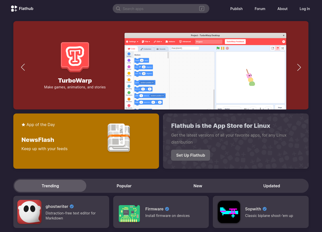
Babe wake up, new flathub frontend just dropped
Linux
From Wikipedia, the free encyclopedia
Linux is a family of open source Unix-like operating systems based on the Linux kernel, an operating system kernel first released on September 17, 1991 by Linus Torvalds. Linux is typically packaged in a Linux distribution (or distro for short).
Distributions include the Linux kernel and supporting system software and libraries, many of which are provided by the GNU Project. Many Linux distributions use the word "Linux" in their name, but the Free Software Foundation uses the name GNU/Linux to emphasize the importance of GNU software, causing some controversy.
Rules
- Posts must be relevant to operating systems running the Linux kernel. GNU/Linux or otherwise.
- No misinformation
- No NSFW content
- No hate speech, bigotry, etc
Related Communities
Community icon by Alpár-Etele Méder, licensed under CC BY 3.0
Your comment got me thinking... Is this a big deal, or even a small deal?
I think it's a deal of some proportion. If someone is trying out Linux for the first time and stumbles across how Flatpaks work and starts exploring Flathub, maybe their initial impression will be good enough to consider switching. If something appears to be polished, then maybe it is.
huge deal, software discoverability is one of the worst issues in linux rn.
The flathub website is pure UX garbage so I wouldn't count on any improvements in discoverability. 😄
What of its UX is garbage?
Genuinely curious, genuinely asking.
I've explained in another comment. They have these pages that seem arbitrarily made up to fulfill certain needs but not others.
You can get a list of packages sorted by popularity and with paging, but no filtering.
You can get a list of packages with filtering but it's limited to 1,000 packages for some reason, no pagination, and no sorting.
The way to find these lists is really unintuitive (go on, try to find the second one I mentioned).
There's no package count, unless you find the filter page and add up certain categories (I'm guessing they have about 2,600 packages but it's just a guess).
I have no idea why they can't just put everything I mentioned in one place. There's no reason they can't have a page with search, categories, sorting, pagination, and counts. I struggle to think why this one page can't be the homepage (with whatever defaults they think it makes most sense, like most popular packages first by default).
Having a homepage that only shows a handful of categories and a handful of apps in those categories really hurts discoverability. You'll never be able to find an app like Stellarium for example if you don't already know its name – and this applies to the vast majority of those 2,600 apps, and it will only get worse as they add more.
I'm guessing they made this design back when they had very few apps, took a lot of time to release it, and by the time they did it was already outdated.
I hope it will change software discoverability on linux for the better.
TurboWarp looks suspiciously like Scratch
I like this style, reminds me of modrinth
It's the Gnome/adwaita style. There are many apps (on flathub) which have it too.
Comparisons kills the art
Lol how the fuck do you browse packages? Did they forget to add a link to "apps" or something to the top menu?
You have to keep scrolling down the front page and look at categories and maybe press "More Productivity" and you get to see the packages in that category. But you can't browse all packages and you can't get a list of all categories.
What about the search bar at the top? It has category filters as well.
I'm not seeing any filters? If I press the search field I just get a prompt.
I saw there's a slash sign in a square but I can't figure out what it's for. If I click it it dissapears, if I type "/" in the bar I get nothing.
Edit: so if you press the search button with nothing written you get to https://flathub.org/apps/search which is a somewhat more useful page. The default listing there is still garbage because it's hard-limited to 1000 apps for some reason but there's no pagination and no sorting(?). But at least you get a filter bar on the left so there's that.
Also if you scroll aaaall the way down to the footer of the page there are some links to "collections" such as "trending" and shit. Which has pagination but no filters and no sorting. 😆 And the distinction between the "trending" and "popular" collections is left as an exercise for the user, I suppose.
It's like it was designed by someone who's never seen or used a package repository in their life.
Yeah, it really is more like google play store or shopping websites and similiar apps/websites (although there are some that have a better design I guess). I'm not really a fan of it either, but I guess people being used to those (which is probably the majority of the userbase of flatpak) feel more comfortable with it.
My guess with the difference between "trending" and "popular" is that the former means lots of recent downloads and the latter a lot of downloads in a longer timespan (e.g. a year or so)
Looks nice
They finally got Sopwith.
