@kde@floss.social
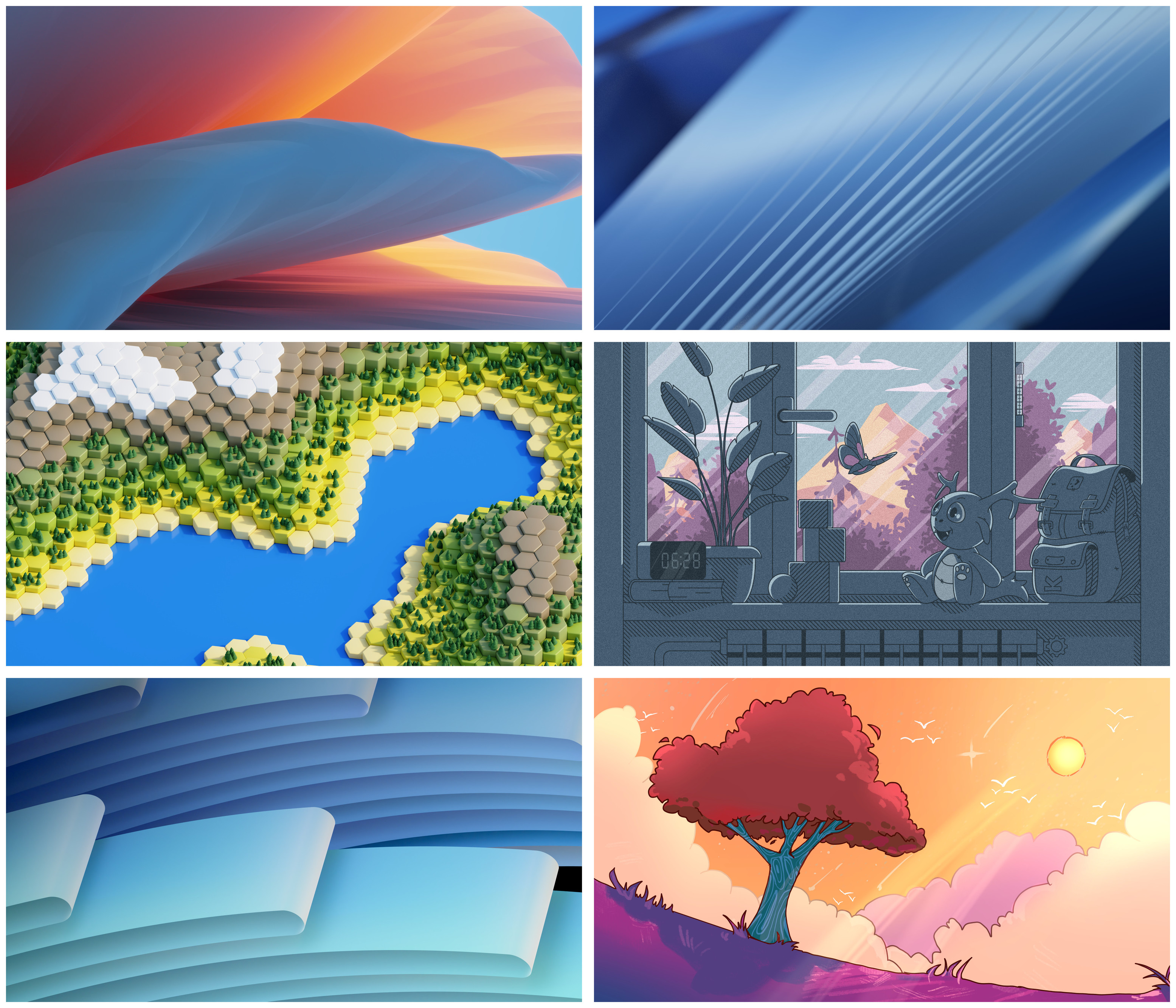
The bottom right is great. Modern, warm, enough contrast, ... . Imho going with plain blue or green backgrounds are becoming a cliche in KDE and tbh a little bit old-fashioned.
KDE
KDE is an international technology team creating user-friendly free and open source software for desktop and portable computing. KDE’s software runs on GNU/Linux, BSD and other operating systems, including Windows.
Plasma 6 Bugs
If you encounter a bug, proceed to https://bugs.kde.org, check whether it has been reported.
If it hasn't, report it yourself.
PLEASE THINK CAREFULLY BEFORE POSTING HERE.
Developers do not look for reports on social media, so they will not see it and all it does is clutter up the feed.
Agreed. That or top left for me.
Bottom right for sure
Bottom right all the way
Top left looks best as a default wallpaper in my opinion. Nice mix of colours, not too bright or too dark, and generally seems appealing while not being too distracting.
Top left or bottom right
Fiery tree bottom right!
Bottom right
Bottom right FTW. Love the colors and sense of serenity
Bottom right looks awesome, but mid right has potential too. The only thing holding it back imo is the overall grayness of the foreground being a bit too much.
@kde@floss.social @kde@lemmy.kde.social right bottom (the tree) is the best, the one above it is the second place
Hands down the tree.
@kde@floss.social @kde@lemmy.kde.social bottom right - it's bright and gorgeous and unique without being too busy.
Bottom right
Bottom right.
Oooh, I love both middle right and bottom right, but I think I prefer middle right.
The minecraft biome gave me trypophobia
I like bottom right the most, but it does't really feel like a default wallpaper as much as top left. Middle right feels like part of a tiling WM with custom colors more than a default for a DE.
I like bottom right best. It might be a bit to bright though.
Hmm~ I would say that the bottom right one caught my eye, but I would go with the top left one as the default wallpaper. It looks sophisticated and clean. It depends on the first impression you want to give.
I like the bottom-right the most, but I feel like top-right and bottom-left are what I would most associate with being a default desktop wallpaper.
Bottom right or the one above it. I'm a sucker for these cartoony looking wallpapers
Bottom right
@kde @kde@lemmy.kde.social Awww, all of them look gorgeous!😍
I'd like to have all of them as a wallpaper switching out one for the other every time I log in (I know there is a setting for it).
But if I had to choose: the bottom left one. ✨
Sorry but I don't like them much. They seem kinda similar to past ones.
If I had to choose I would say top left.
@kde@floss.social @kde@lemmy.kde.social I like middle-left. Bottom right is very Plasma-y, me gusta.
Bottom right or middle right.
Bottom right. Nice and colorful
In order of preference, bottom right, middle left, and middle right.
I love the adorable and wholesome cartoons that KDE includes in its background collections.
Top or bottom left
@kde@floss.social @kde@lemmy.kde.social you probably want to give them labels, so people can vote on them.
Middle right, bottom right, and then middle left in that order. Anything else I wouldn't rank in any order because I don't like them at all.
@kde@floss.social @kde@lemmy.kde.social
i *need* the one in the bottom right corner! :3 :blobhaj_hearts:
the bottom left one
6
This is hard, so many are great!
they're all so good. the artists outdid themselves!
@kde@floss.social @kde@lemmy.kde.social why not include them all as an option? They're all beautiful and worthy of KDE!
@kde@floss.social @kde@lemmy.kde.social tf you mean I have to choose 😭
