this post was submitted on 12 Jul 2023
219 points (100.0% liked)
Beehaw Support
2801 readers
1 users here now
Support and meta community for Beehaw. Ask your questions about the community, technical issues, and other such things here.
A brief FAQ for lurkers and new users can be found here.
Our September 2024 financial update is here.
For a refresher on our philosophy, see also What is Beehaw?, The spirit of the rules, and Beehaw is a Community
This community's icon was made by Aaron Schneider, under the CC-BY-NC-SA 4.0 license.
![]()
![]()
founded 3 years ago
MODERATORS
you are viewing a single comment's thread
view the rest of the comments
view the rest of the comments
This might be just me, but my first impression was the new logo felt more "aggressive"... like the bee is more confrontational by looking you straight into the eye and being ready to attack.
I think I like more the one on @UrLogicFails@beehaw.org profile banner: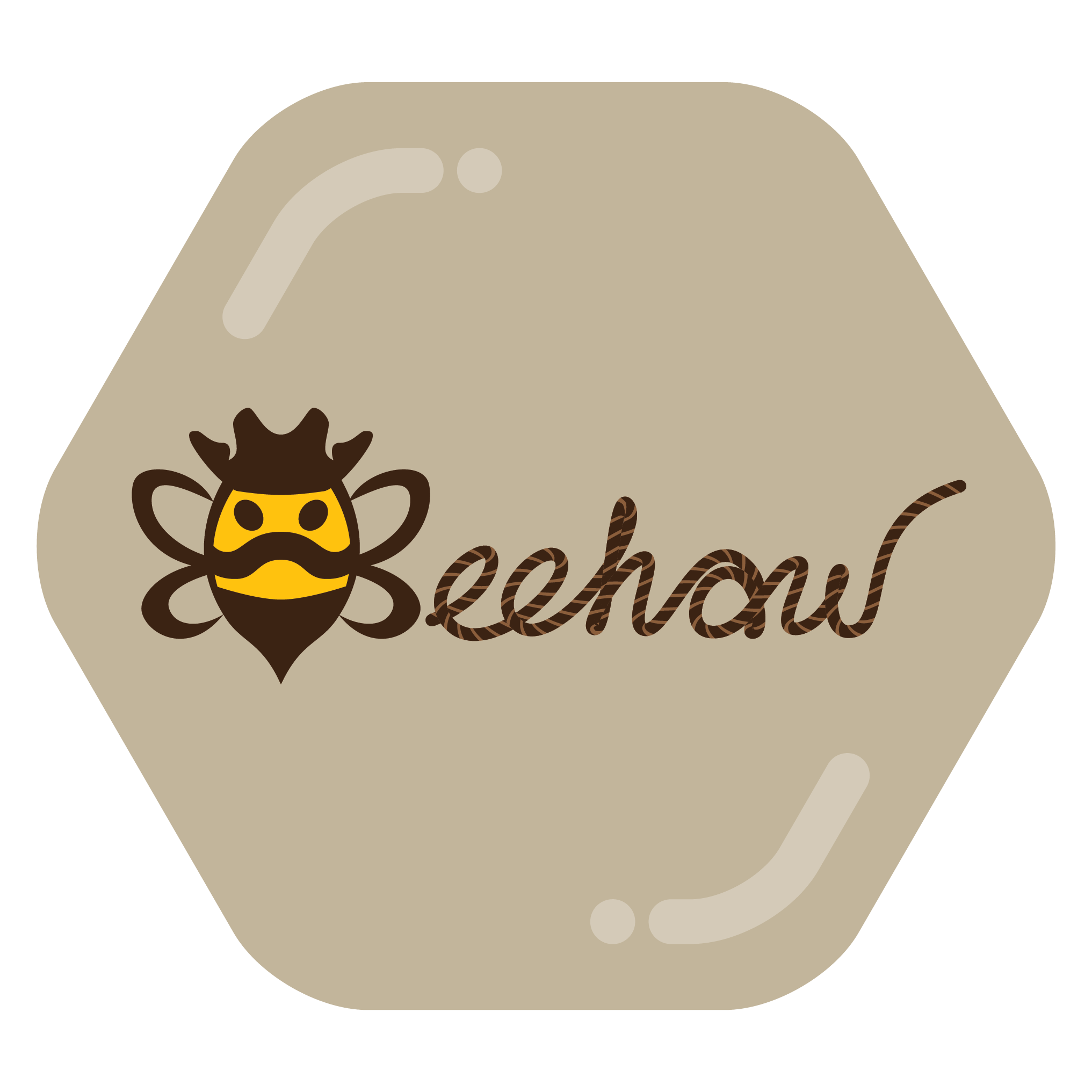 ...with the moustache making it more cartoonish, and less "oh f*ck, a bee is trying to sting me!".
But again, this is just my personal impression, and some possible bee fobia.
I say you have a point. The moustache look makes it more friendly. You can also see the butt/stinger as a bandana!
The mustache version was actually an early option I made when I started designing the logo. Ultimately, we decided to go in a different direction but it definitely still holds a special place in my heart.
I think he looks like he has a really fabulous moustache and a cowboy hat.
Edit. I didn't realise it was supposed to be a cowboy hat!
To me, the moustache reads like a frown, making this bee read as more aggressive.