this post was submitted on 07 Sep 2023
523 points (100.0% liked)
Memes
1357 readers
11 users here now
Rules:
- Be civil and nice.
- Try not to excessively repost, as a rule of thumb, wait at least 2 months to do it if you have to.
founded 5 years ago
MODERATORS
you are viewing a single comment's thread
view the rest of the comments
view the rest of the comments

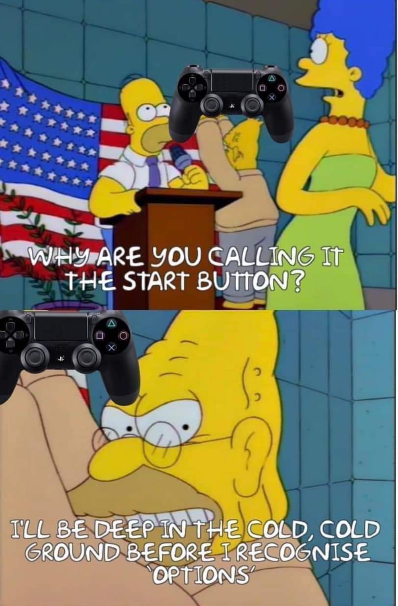
I get being nostalgic for Start/Select but how does Options/Share not make more sense? The options button brings up a menu of options for most games and share allows you to share screenshots or video from the game. Whereas start did the same thing options does now which has nothing to do with the word Start and Select was sorta a catch all button for an action you only used occasionally, but was never used for selecting which was usually X but sometimes one of the other shapes.
Options I kinda get but it sounds dumb to me, would've been better as "menu" because it's not exclusively for options, also for pausing and other menus.
Share isn't what that button normally does at all in my mind, sure maybe PlayStation have it bound to that but normally it brings up an alternate menu to start that isn't the pause menu (like in Minecraft and overwatch it brings up player list/scoreboard as an example
A lot of games I believe use it for the map too
I haven’t played Overwatch or Minecraft but every game I’ve played with one of those options used pressing in the touchpad to do that. I’ve never played a game where the share button didn’t share somehow.
I just looked it up and for Minecraft it’s used to take a screenshot or bring up a screenshot menu. I couldn’t find anything for Overwatch though. Are you sure you didn’t remap the button? Or are you using it for PC? It might work different in that case.
I do agree that menu would’ve been a better name, but that doesn’t mean that Options doesn’t make more sense than Start which is what the original comment said.
I was thinking of java edition Minecraft which I now realize I made my own configuration for
Still, not sure where I've got it from but I've definitely got the idea the select button is for menus that aren't the start menu