Thanks for the feedback!
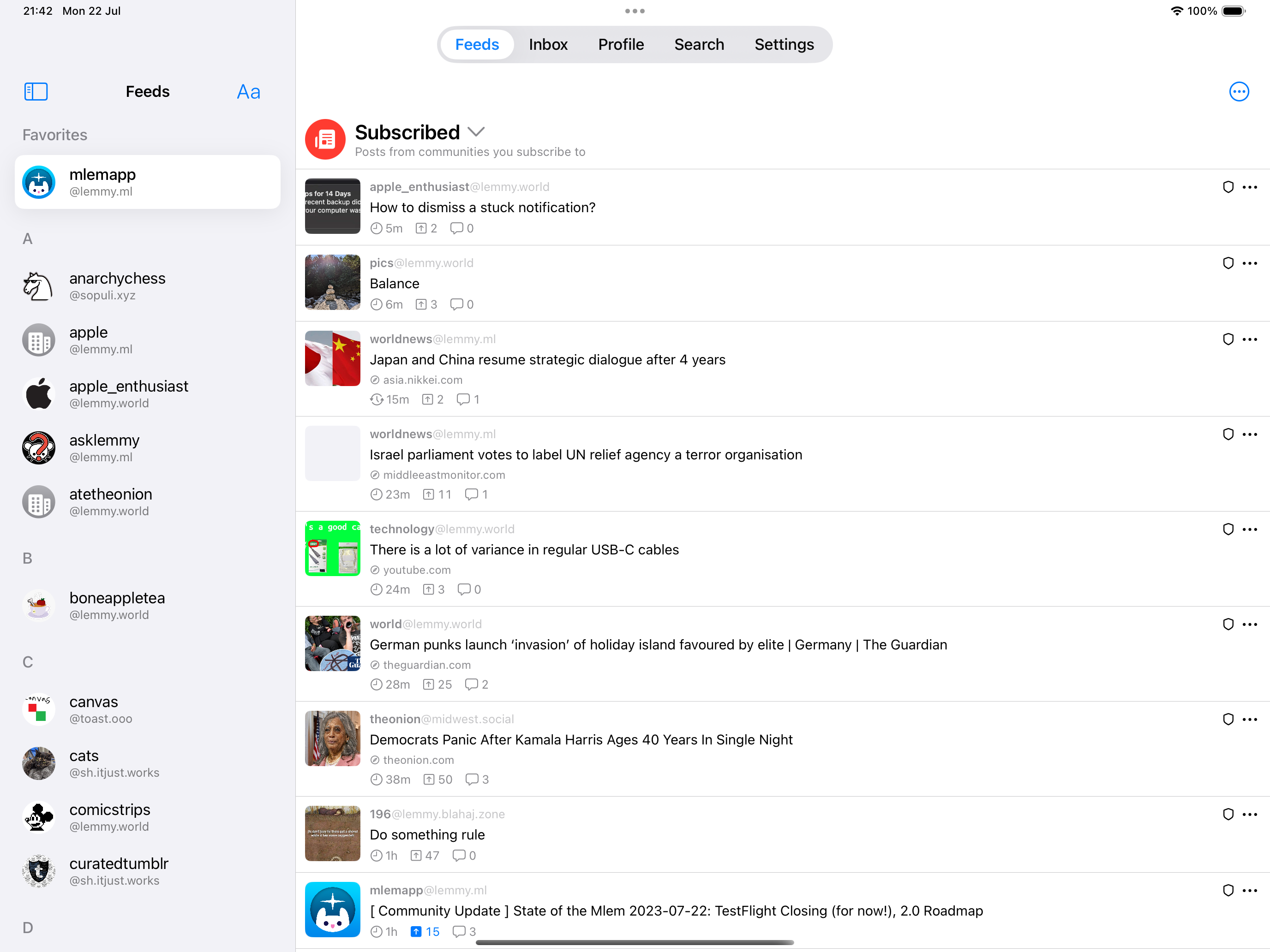
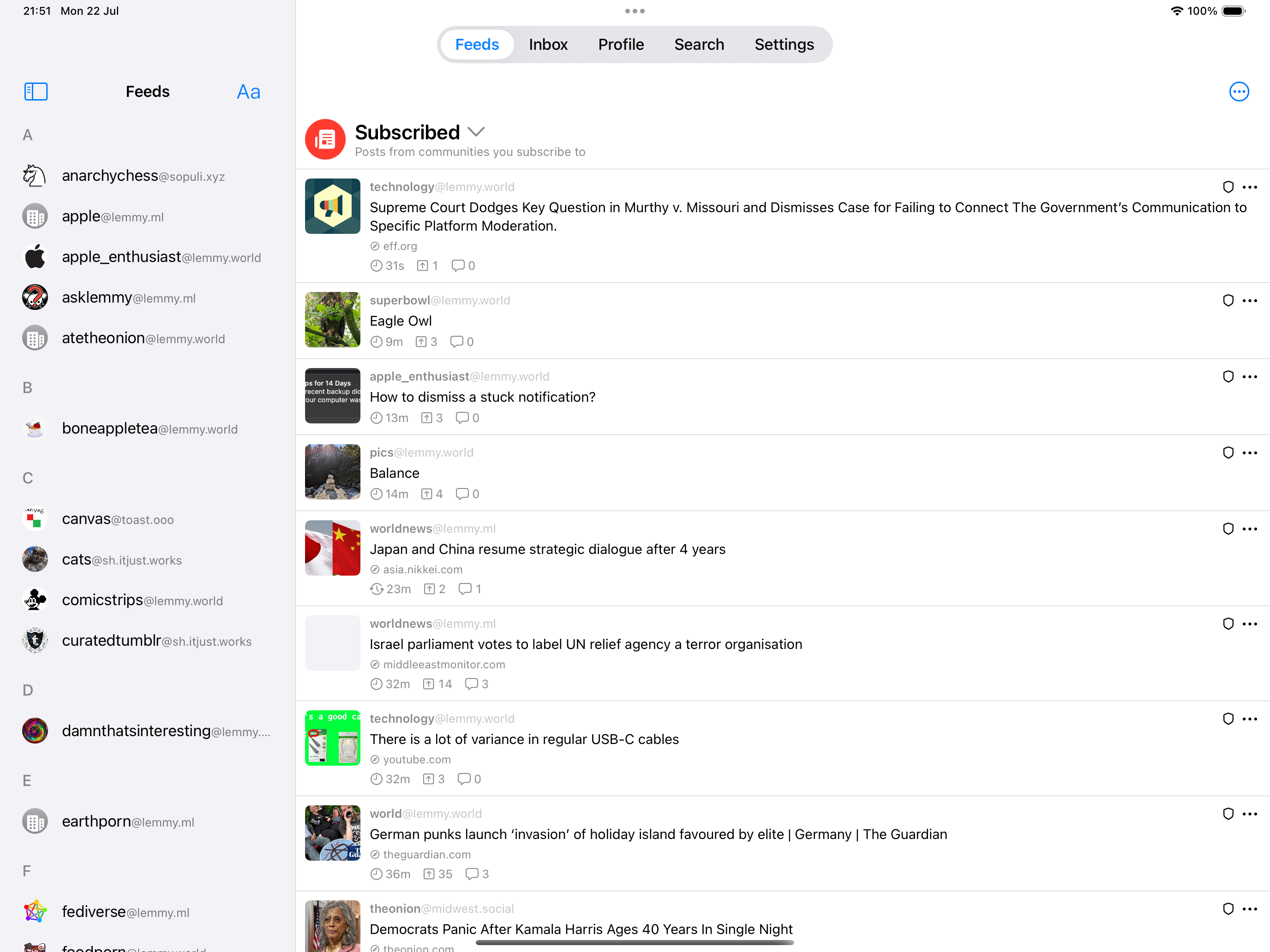
Please add more breathing room/padding to posts — it’s stressful how close posts are to each other (could mostly be solved with just a few more pixels of negative space under the interaction bar before the divider).
Yeah, I'm not happy with the padding there either and we're experimenting with some ways to improve this.
Also, some text feels like it’s cropped by the edges of my iPhone. There is more than enough room to spare on the iPhone Pro Max for that additional comfort.
I'm not sure what you mean by this. Would you mind providing a screenshot?
The interaction bar customization doesn’t allow me to customize it the way I want because it doesn’t consider that I have more space for actions if I remove some readouts. Also, I’d like to reorganize readouts.
I'll look into allowing more space for actions if readouts are disabled. Reorganising readouts is planned in the future, though it may not be in v2.
Almost all settings should be specific to the account they were changed under, like settings of users on a pc. Currently, a change under one account is made to the other accounts.
We're considering applying this to certain settings, such as the "Blur NSFW" setting. We're hesitant to apply this for all settings, because we don't want the settings system to become too complicated for the user. Users might find it annoying if they have to go through all of their accounts to apply a setting change that they want to make globally.
Upon returning to my list of subscriptions (from my All feed for example), my subscribed feed may be highlighted, even though that’s not the page I’m on, coming from, or have selected.
We're looking into it 👍


Sure 👍 Mlem v1 had this; we'll be adding it back in