Wordle 1,135 4/6

⬛🟨⬛⬛⬛
🟩⬛⬛⬛⬛
⬛⬛🟩🟩🟩
🟩🟩🟩🟩🟩
Librerian
It does lack a few features though, as they rely on proprietary software/libraries. Android Auto for instace, as well as ANT+ for connecting sensors. At least for those features you need the Google Play version.
You need to be unplugged for 12 consecutive months for Proton to delete your account because of inactivity though, which seems fair for free tier accounts. A simple login is enough to prevent this, you do not need to send an email or whatever, simply log in once a year. You also get reminders sent to your recovery email before this happens. Data storage for inactive free tier accounts isn't free for Proton.
I believe you're right. However, if memory serves, the ads did change occasionally, meaning the screen had to refresh, leading to increased battery usage.
I just sent them a message asking them to disable the ads on the kindle I had recently purchased, and they did so for free, no root needed. That was a few years ago though, so I doubt they do that anymore...
I find that Neo covers most of my needs. Although there is one thing in particular that I miss: swiping actions on seperate icons to launch another app/action. I haven't used Nova in a while, but it had nicer previews inside the options, and I find that Neo has a few minor bugs that annoy me at times. But Neo has the things that are most important to me: multiple pages, tabs or folders in the app drawer, icon pack support, search and gestures (not on each icon, as noted earlier). I also miss the ability to place icons between the defined grid as in Nova.
I use KOReader both on Linux and Android, and I love it! I used Calibre's own reader for epub files earlier, but have since used a bit of time getting to know KOReader and its features better, and it suits my needs very well.
I stopped using Nova Launcher when it was aquired by an analytics company, since launchers usually have access to a lot of permissions, and I don't trust a company dealing in analytics to operate in good faith with that access. I have used Lawnchair 2 and recently switched over to Neo Launcher.
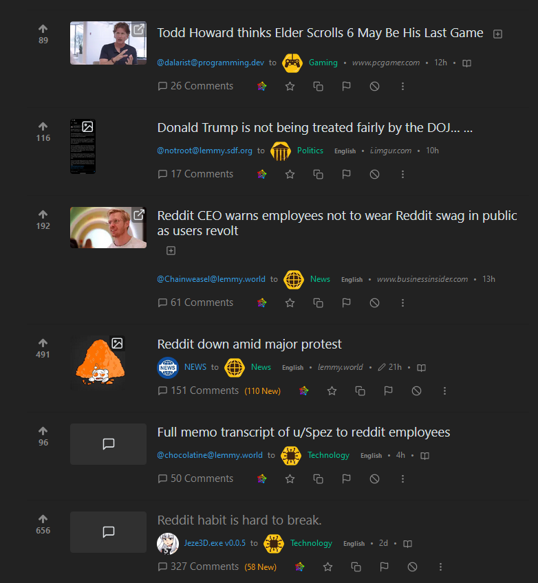
And to add a little more: the icons contribute to making the Local timeline for Beehaw to become overly "busy", since every post has a very stand-out yellow icon under it, usually signifying something important (hence why it should stand out). The icons become to prominent, especially considering the websites dark background color. I can see the appeal of being able to easily identify Beehaw-communities in Subscribed or All timelines, but to be quite honest, I find that the overly attention-seeking color choice of the icons clutter up the Local timeline to a point where they are more of a nuisance rather than conveying any kind of distinguishing information about the community. My Local timeline now looks like this:

Don't get me wrong, I think they are beautifully designed, but the color choice is very much working against conveying any useful information at a glance (except what instance theyy belong to...). There is a reason that not all traffic signs have the same colors.
I agree to your points. Having every icon be the same colors (black and yellow) really makes it hard to distinguish the different communities at a glance. For instance, the Open Source Initiative keyhole logo/icon used as the logo for the Free and Open Source Software community is usually green, and having it be black on yellow background is actually in direct contradiction to the OSI Logo Usage Guidelines section 2.1 – "Never Stray from the Color Palette", where an example of a yellow/red icon is present. So there are also such considerations that has to be taken. Also
You may not remove or obfuscate either of the TM or ® symbols in the OSI Logo.
So either way that icon has to be changed to be in compliance with the usage guidelines (@alyaza, @Gaywallet and @UrLogicFails ), since I believe the Beehaw-community does not want to infringe on such a point. I am also then not sure if @UrLogicFails can release the icon under a license as is done here, since the keyhole logo is trademarked (see the OSI Trademark Guidelines). See for instance how !opensource@lemmy.ml has solved this. They use the icon with the ® symbol as well as attributing the OSI in the sidebar:
Community icon from opensource.org, but we are not affiliated with them.
I think the color palette of the community icons shouldn't be restricted to only black and yellow, that makes everything "scream" as that is usually a color combination used to express a warning or announcement. I'm no graphic designer by trade, but I think colors should be used as a distinguishing feature between the instances commmunities, and less dramatic colors, so to speak. Having the icons have a hexagon shape should be enough to recognize them as Beehaw-communities, even if they have different color schemes.
Any particular OS? For Android I use Broccoli, and I think it does a good job out of the box. You can share the URL of a webpage with a recipe to that app, and it will try to extract the ingredients, steps, serving etc. from the website :)