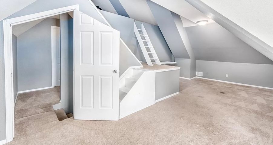
I have a feeling this was a kids room. Y'all are harsh, this would be dope as hell for a kid.
Terrible Estate Agent Photos
Terrible photos listed by estate agents/realtors that are so bad they’re funny.
Posting guidelines.
Posts in this community must be of property (inside or out) listed for sale which contains a terrible element. “Terrible” can refer to:
-
the photo itself (finger over the lens, too far away, people in the shot, bad Photoshop, etc.)
-
the property (weird layout, questionable plumbing, unsound structure, etc.)
-
the interior (carpeted bathrooms, awful taste interiors, weird mannequins/taxidermies/art, inflatable pools indoors, etc.)
-
the actual listing itself including unusual descriptions and unrealistic pricing. However, this isn’t a community to discuss the housing market in general. This is a comedic community - let’s keep it light.
-
Photos can be sourced from anywhere and be any age, but please check they haven’t already been posted.
-
Censor any names/contact details of private individuals.
-
Mark the post NSFW if it includes nudity or sensitive content
Rules.
This community follows the rules of the feddit.uk instance and the lemmy.org code of conduct. I’ve summarised them here:
- Be civil, remember the human.
- No insulting or harassing other members. That includes name-calling.
- Respect differences of opinion. Civil discussion/debate is fine, arguing is not. Criticise ideas, not people.
- Keep unrequested/unstructured critique to a minimum.
- Remember we have all chosen to be here voluntarily. Respect the spent time and effort people have spent creating posts in order to share something they find amusing with you.
- Swearing in general is fine, swearing to insult another commenter isn’t.
- No racism, sexism, homophobia, transphobia, xenophobia or any other type of bigotry.
- No incitement of violence or promotion of violent ideologies.
The dimensions of Gilman's attic room are unusual and seem to conform to a kind of unearthly geometry. Gilman theorizes that the structure can enable travel from one plane or dimension to another.
"The Dreams in the Witch House" by HP Lovecraft (1933)
There it is, saved me having to do it.
There's so much to dislike, but I think the thing that irrationally bugs me the most is the fact that they chose a 6 panel door and just chopped the top off it right through the panels. Instead of, you know, just buying a different kind of door.
Also the door position relative to the stairs. It's horrible and even dangerous.
In most situations it'd be fine. I wouldn't want to move a couch through it though.
Probably not fireproof anymore. In case being up to code is an expectation here
If someone renovate the place, that's the only good decision they had the opportunity to make. So they decided to stick with the theme.
Ngl, I kinda like it lol. As a kid I would have wanted a room like this so bad.
McEsher flipping houses now ?
I really want to see more angles of this room. It's so weird, and I just want to understand how weird.
There's a lot of angles already in the picture, you want more?
Y’all are harsh. This looks like someone optimized the architecture of the space as best as possible. The only thing that bothers me is the choice of door where it’s chopping the panels awkwardly.
Without being able to see the other side, the door swing direction bugs me too. Like why does it open to the middle of the room blocking the stairs there, instead of towards the wall? Otherwise it seems pretty cool. Probably a kids room + upscale attic.
I live for this shit
I already have a headache and this didn't help at all.
Caligari with the lights on.
Idk, this looks fun!
So that's what all the McMansions look like underneath the weird rooves.... that's interesting I guess, but the door has a different angle than the roof (maybe it fits the roff on the other side?). I don't hate it, but I wouldn't want it either.
Almost seems like something an AI would generate...
Levels, Jerry!
Escher-esque
Why are there stairs and a ladder right next to each other?
For people who can't choose.
Are you talking about going from the landing up? I don't think those are more stairs on the left. That's the ceiling over the stairs outside the room. You go up the short stairs to the hybrid stairs/ladder to get to the loft area.
You're probably right. I guess just having another set of regular stairs on the left would've made too much sense.
I think putting stairs on the left doesn't work because you'd be walking right into the wall/roof. There's no standing space above that. In fact, that entire upper section is too low to walk in. I assume it was meant as a child's bed nook. They clearly just converted the attic into a child's bedroom.
Fucking standard Norwegian rental property.
I think I get it… they really like the chutes and ladders game and wanted a irl version!
House of Leaves headass house.
Looks straight out of Squid Games
What has Impressionism done?
Cubism
Yeeeeah, you see what I was trying to do there.
Maybe if I squint a little... from over here...
I don't think this BNB is ADA compliant...
This looks like an art installation!
