Nova launcher. I like the custom icons, specifically the Line Free package. I also wanted the wrap around scrolling for home screens which wasn't a feature on the first phone I put nova on. No idea if it is on my current phone because I went straight to Nova.
Asklemmy
A loosely moderated place to ask open-ended questions
If your post meets the following criteria, it's welcome here!
- Open-ended question
- Not offensive: at this point, we do not have the bandwidth to moderate overtly political discussions. Assume best intent and be excellent to each other.
- Not regarding using or support for Lemmy: context, see the list of support communities and tools for finding communities below
- Not ad nauseam inducing: please make sure it is a question that would be new to most members
- An actual topic of discussion
Looking for support?
Looking for a community?
- Lemmyverse: community search
- sub.rehab: maps old subreddits to fediverse options, marks official as such
- !lemmy411@lemmy.ca: a community for finding communities
~Icon~ ~by~ ~@Double_A@discuss.tchncs.de~
I stopped using Nova after them being bought by a company dealing with telemetry. I don't want to lose control of the data my launcher has access to.
Lawnchair alpha
Lawnchair, it does everything from nova that I liked
that I liked....
What happened to Nova?
Edit - ah, saw it further down. Bugger.
Nova and Niagara seen to be the overwhelming favorites, but I like Smart Launcher. My brain doesn't cooperate with lists of apps in alphabetical or whatever, I lose apps or forget the name. Smart is great because it categorizes the apps into six default categories automagically, and you can edit/add/delete the categories or which category each app gets sorted into. So my Internet apps are on one space, games, media, etc. Makes the list of apps much easier to deal with. Not that it's perfect. Sometimes apps go weird places, but that's easy to fix. There's a bunch of other stuff, but that's my primary reason for using it.
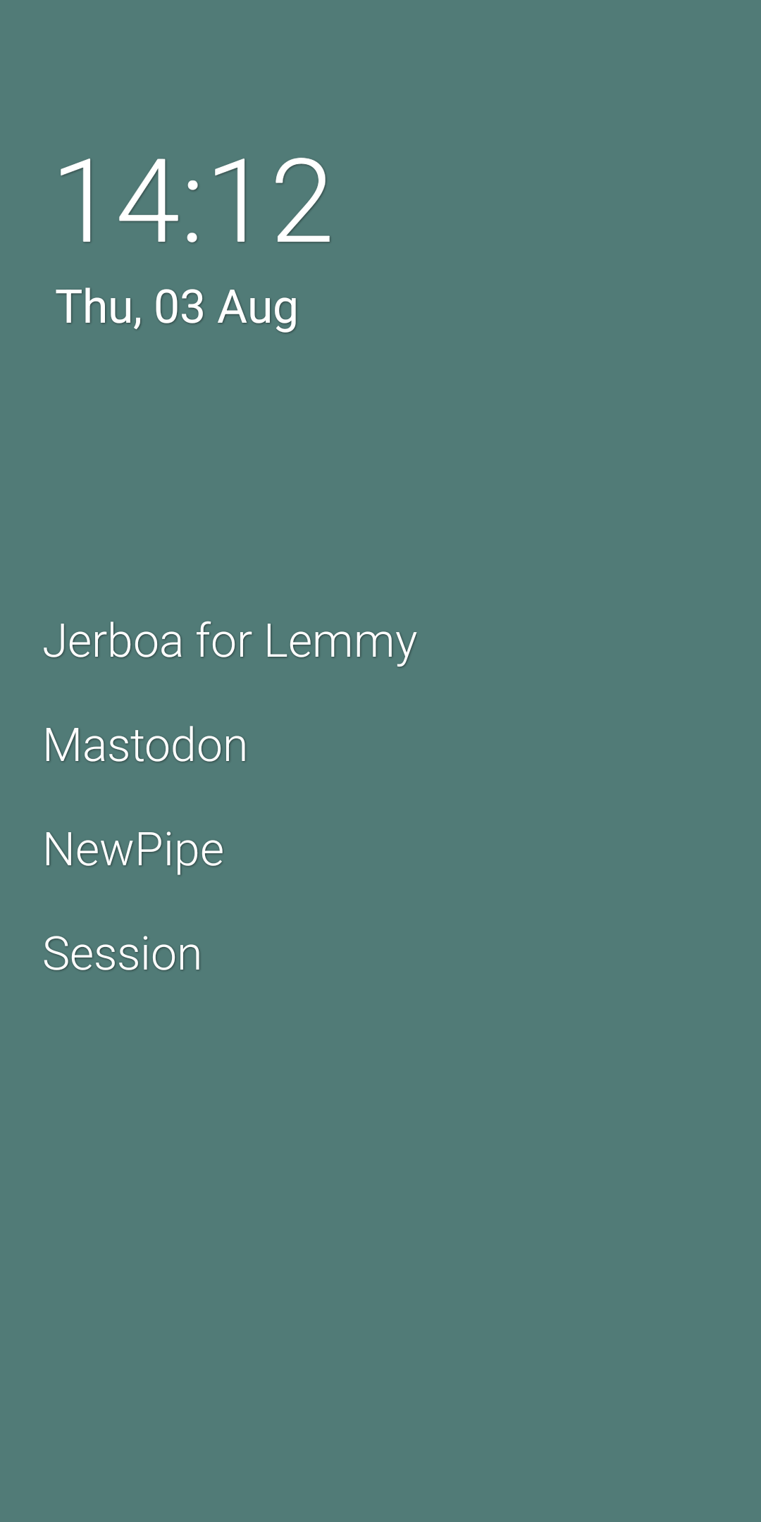
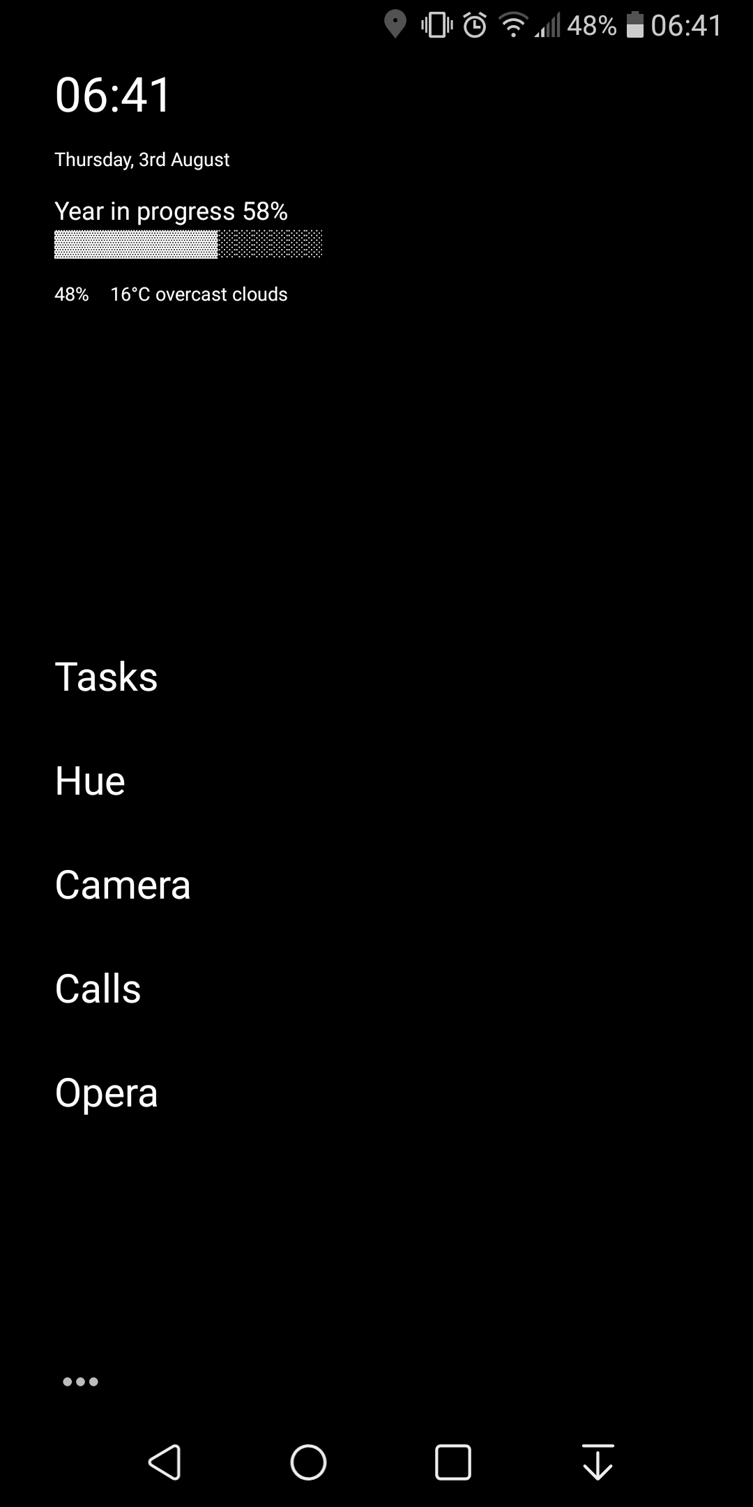
Olauncher is open source minimalist launcher. VERY minimalist. You can get up to 8 apps on the home page and swipe down to search for all other apps.

Indistract launcher Haven't found a better minimalistic/clean launcher even though it has some bugs. My home screen:

Kvaesitso, it's simple, beautiful but has a lot of functionality, customizable and open-source :)
KISS Launcher. Perfect companion for a hardware keyboard (https://github.com/Dakkaron/Fairberry).
In general, you use it like the Windows start menu. Type the first few characters of an app name, hit enter and there you are.
Action launcher (paid version) is my go to, some features I love about it:
-
Allow for a desktop grid of up to 12*12, which I havent seen on any other launchers I have tried, I believe Nova had something similar, but not sure to this degree.
-
The brilliant folder icon being the shortcut to the app which was the first app to have been put in it feature. You can later shuffle the app around to change it, of course. You swipe down on the folder icon to reveal the items inside like usual, but if you just tap on it, the app which is first in the list opens up, a very good time saver in my opinion.
-
Widget stack is a cool feature also, where you can add similarly sized widgets to a single block of space on which you can scroll through to see the information as it suits you.
-
Customization level is very high, you can have a dock, a drawer, and also a quick drawer which is a vertical list of apps, and all of these simultaneously too.
-
A high level of gesture support. My phone just got an update where I have to swipe down from different sides to see notifications and quick settings, which are not changeable by default. With the action launcher settings I have sort of found a work around.
It allows me to have a minimal looking desktop with a lot of functionality and a high degree of customisation, very much worth the price.
Olauncher - very minimal, no distractions. Shows the app's full name instead of icons, handfull of links on the main page, the rest can be found in the app drawer in a long list of app names.
Edit: just saw the mention here of mlauncher, an open source fork. Making the switch now 🙂
I'm a pixel user. I switched to Niagara. I didn't like it at first, but now I love it. It's just very different from what you think a launcher should be. It's not my forever launcher but I enjoy it for now. It's been a year or so
(I used to love Cyanogen. RIP)
Niagara is amazing, its also reduced my brainless scrolling quite a bit. I'm still here though, scrolling.
I use mLauncher, a fork of OLauncher. I like how simple and clean my screen is.
Since Nova has been bought I've replaced it with Neo Launcher. I like it 'cause it gives the option to resize widgets, customize the size of the home screen grid and add swipe up actions to home folders.
I use smart launcher. Have for probably 7 or 8 years. Never paid for it... Free version is perfectly functional. Pixel 6 pro.
I have six icons on my home screen, I love the double tap feature that can launch another app from those home screen apps. The app pages take no more than 3 buttons to find any app since it is sorted by letter or category.
It's easy. I haven't even really thought about using anything else.
I use Nova. I recently bought a Samsung phone and was tempted to give One UI's launcher a try, but there was one feature that I instantly missed. Forget about all the personnalisation, there was one deal breaker.
The search bar.
The search bar in Nova, especially in the beta builds of Nova 8, is just so good. I can search for any app, yes, but I can also search on the web, on Wikipedia, on YouTube, on Maps, on a ton of things very very easily. It also offers shortcut search, contact search, quick unit conversions and it's connected to DuckDuckGo, my search engine of choice.
I can also place a search widget on the home screen/dock. I couldn't do this on One UI's launcher and I just don't get why. As someone that primarily opens apps by searching for them (whether that's on my phone or on a PC), having a quick and easy to access search bar is just essential.
Another vote for KISS. Took some getting used to, but now I have trouble using any others.
The search is so handy.
Pixel 6 Pro here, had been using Nova Launcher for ages and purchased a license for it. Once it changed owners I swapped to Hyperion launcher, while it is decent and has similar functionality to Nova is just not quite the same. I suppose it depends on how picky you are about privacy...
On a Pixel with GrapheneOS
I use KISS, I wanted an opensource launcher
Its quick actions, history and tags are exactly what I need.
You need to customize it heavily to get it to look good: I use a very minimal amoledBlack&white config with Arcticons and I love it
Nova was my jam for the longest time, then CPL (Customised Pixel Launcher) due to its google feed integration & good customisation. Now that I've stopped using the google feed (I get my news from ~~reddit~~ lemmy) as well as it isn't actively maintained anymore, I've switched to Neo launcher as it's FOSS as well as having a very light footprint and specific features such as categories in the app draw.
I'm using Lawnchair, have been for a few years now. It does everything I need it to without getting in the way.
I've been using Nova for a really long time. When I get a new device, I'll check out whatever isinstalledg for a while, but I always end up going back to Nova. Easy to use, hides apps, enough customization without being overly technical.
I like Nova Launcher. Compact. Flexible. Consistent interface regardless of what craziness Samsung tries to impose. Good gesture customization. Don't need to learn anything new.