The rates of updates is wild. People like you are turning the fediverse dream into reality. Thank you.
Connect for Lemmy App
A community for the mobile app Connect for Lemmy.
Links
Awesome! Thanks for the hard work.
Connect has fast become my chosen lemmy app, thanks for the hard work!
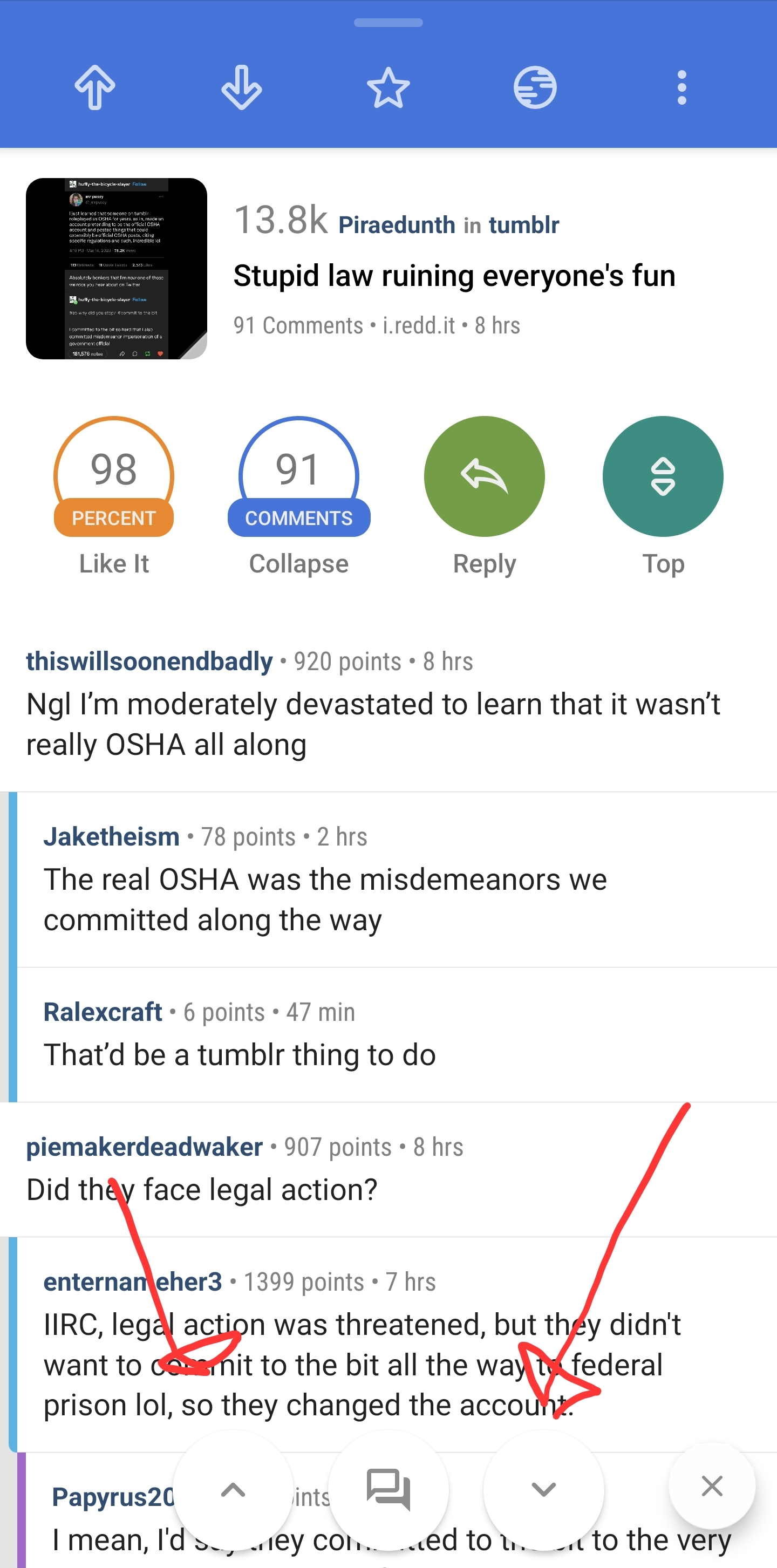
One thing I miss from Relay is the comment navigator buttons floating at the bottom, any chance of a feature like this?

Hi. Thanks for the feedback! I can take a stab at it. What does that second button do with the comments icon?

It brings up this search interface
- Threads will navigate between top comments
- Search word will ask for a search term and then navigate between comments with that term.
- Time will prompt user to input an amount time with a slider bar, navigation arrows then only look for comments that are newer than that time
- moderator searches for moderator comments.
Wow that really would be great, definitely would be the last thing I'm looking for in the app! Do you have a way of donating to the app?
Thanks for the fast updates.
One request I have is that for when opening web content, the title is just "Web". I think it would be better to show a URL, or "Web - [URL]", to double check that the loaded URL is the expected one. Maybe long press to copy the URL. Maybe a progress bar too.
Thanks again.
All good suggestions, thank you!
While we're on the in-app browser topic, any chance the Android back button can act as a browser back button? E.g. You click a post link, and are in the in app browser and follow another link. The top back button will take you back to the post view, but the android back button just backs you up a browsed page.
Yeah I'll take a look at that as well. Thanks!
Nice! Thanks. Love the app.
Two things I miss from sync:
-
After hiding a post, a small popup that lasts for 10s allowing you to unhide it in case the swipe was a mistake
-
A section in your profile to see hidden posts in case you want to come back to something
Thanks! Fantastic app!
Hi. Thanks for the release. It's excellent and I'm really enjoying using Connect!
Here are a couple of small requests from a compact layout user:
- Would it be possible to add dividers between posts in compact layout? Currently there is a lot of text and little visual separation.
- Would you consider adding an option to move the thumbnails to the right?
And here are a couple of minor issues I've noticed:
- Even though I have comment dividers set to All, a divider is still missing between the post's body and the beginning of the comment section.
- In Swipe Settings, the explanation labels for comment actions are wrong, referencing posts instead.
Thanks again for your work.
Would you consider adding an option to move the thumbnails to the right?
This is the 'reversed list' option under the post customization settings
Thanks! I have no idea how I hadn't tried that before! 😅
hello! thank you for all your great work, the app has come such a long way in the ladt few months! is there a way to disable the page header every 20 posts in the settings ?
Hi, Is there a way to manually set the download path for all downloaded pictures and videos?
And now there's an option to turn off confirmation on exit. 😁
Hide posts above?
Can we please make it so when we block an instance (usually for feed reasons) we don't block every users comments on every thread?
Hi! That's under Block Settings -> Blocked Instances includes Comments.
Yay, thanks!!
Thank you for all your hard work. Would it be possible to let users customise the code block colours? I'm colourblind and find the default quite hard to read.
Currently on 118 beta. The only bug I've noticed lately is that the ampersand symbol tends not to render correctly in comments.
Example: pork & beans
& testing
Edit: that's weird. Thanks for the feedback!
Edit2: it looks normal in the web browser weirdly enough.