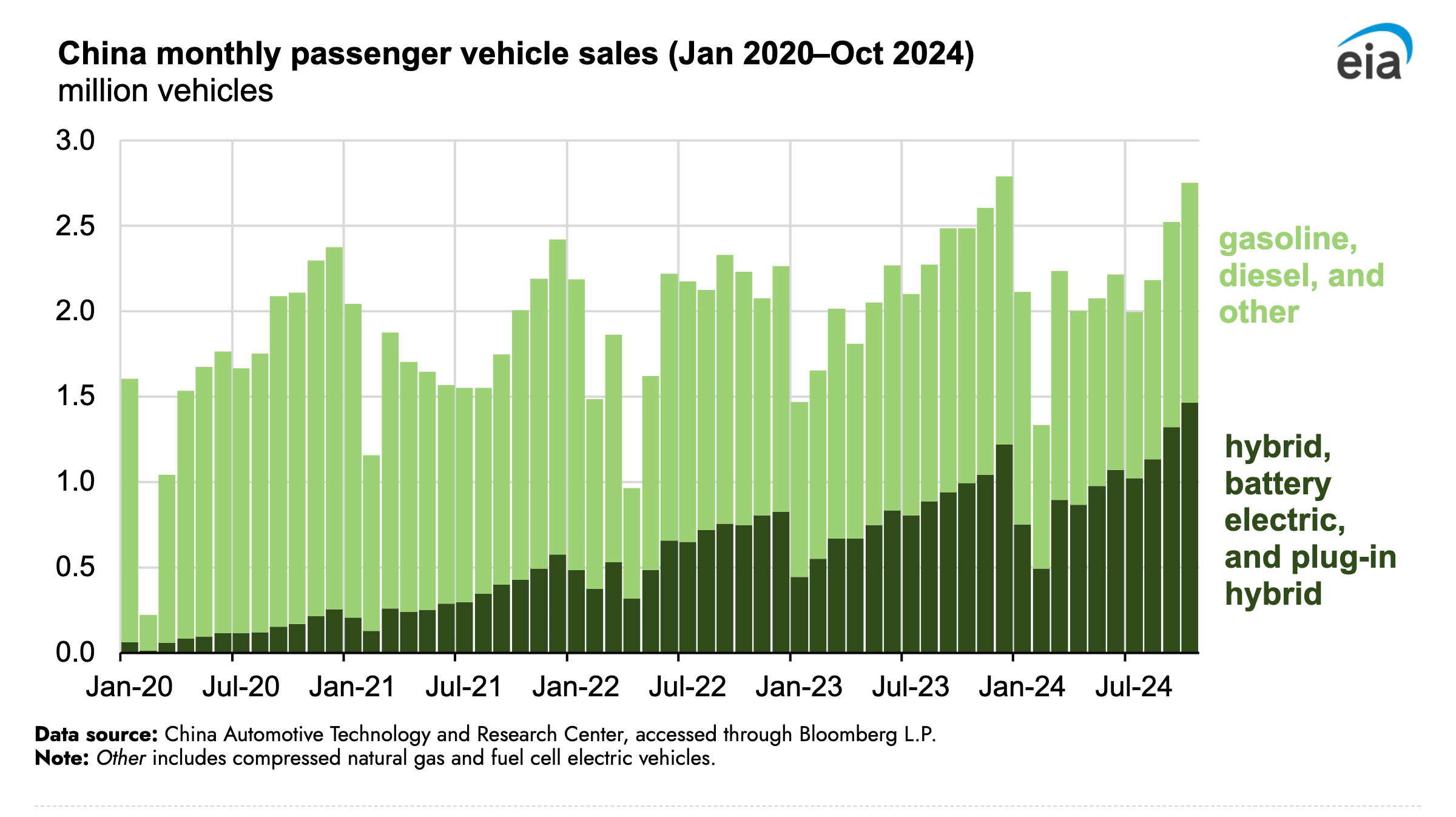
this looks kinda bad no? I mean electric/hybrids are better than gas/diesel but they are still worse than public transit so the growing trend of more cars is kinda sad
this post was submitted on 22 Nov 2024
22 points (100.0% liked)
Data is Beautiful
8 readers
1 users here now
Be respectful
founded 5 months ago
MODERATORS
To be fair, there's also a growing number of people (especially in China). You'd need to have it as a percentage of people, or percentage of use rate.
Colors should be swapped, green good, crude oil bad.
Is it a stacked bar graph?
