this post was submitted on 24 Sep 2024
21 points (100.0% liked)

Firefox

449 readers
1 users here now

A place to discuss the news and latest developments on the open-source browser Firefox

founded 4 years ago
MODERATORS
top 7 comments
sorted by: hot top controversial new old
[–] ReversalHatchery 3 points 1 month ago (1 children)

the only thing you need to see from the article:
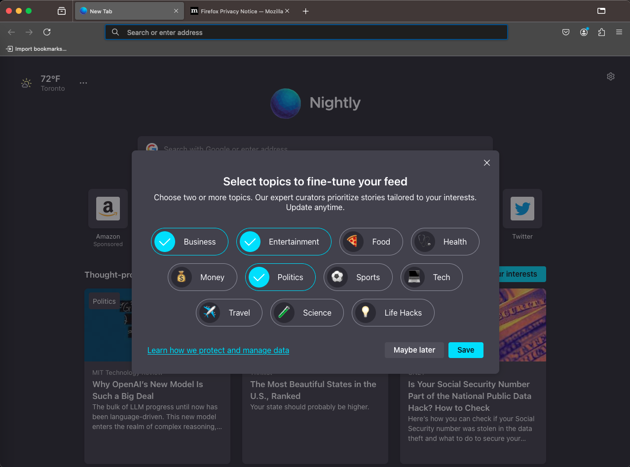
the image shows firefox, and in it a question window of what kind of topics you want to see in your Pocket Recommendations.
The "Save" button is bright, the "Maybe later" is not, the "None" button is non-existent: it's not an option that you dont want to read pocket recommendations!

But at least the topics are curated by experts, so there's that.

[–] LWD@lemm.ee 3 points 1 month ago

Ironically, I don't always agree with the Mozilla brass, but when the CTO said

We consider modal consent dialogs to be a user-hostile distraction from better defaults.

... I kind of agree, in just this on instance. What a dialog to present.

[–] Vincent@feddit.nl 2 points 1 month ago (1 children)

Anyone know what ScotchBonnet is? Something search-related it seems.

[–] neme@lemm.ee 2 points 1 month ago* (last edited 1 month ago) (2 children)

You can get some idea if you check the "depends on" stuff here.

https://bugzilla.mozilla.org/show_bug.cgi?id=1891857

Seems to be just a code name for some updates to the urlbar.

[–] Vincent@feddit.nl 2 points 1 month ago
[–] LWD@lemm.ee 1 points 1 month ago

It's interesting they use code names but never really describe what the features should be. I think they're changing the UI of Incognito Mode too, or at least doing something labeled under "Felt Privacy."

I don't expect it to be user friendly, but surely there is a description of it around somewhere?

[–] possiblylinux127@lemmy.zip 1 points 1 month ago

Horray that is exactly what I asked for.

Seriously though they should go the minimalism route. I think that is part of the appeal of Chrome.