@kde@floss.social @kde@lemmy.kde.social sorry, not relevant to the topic.
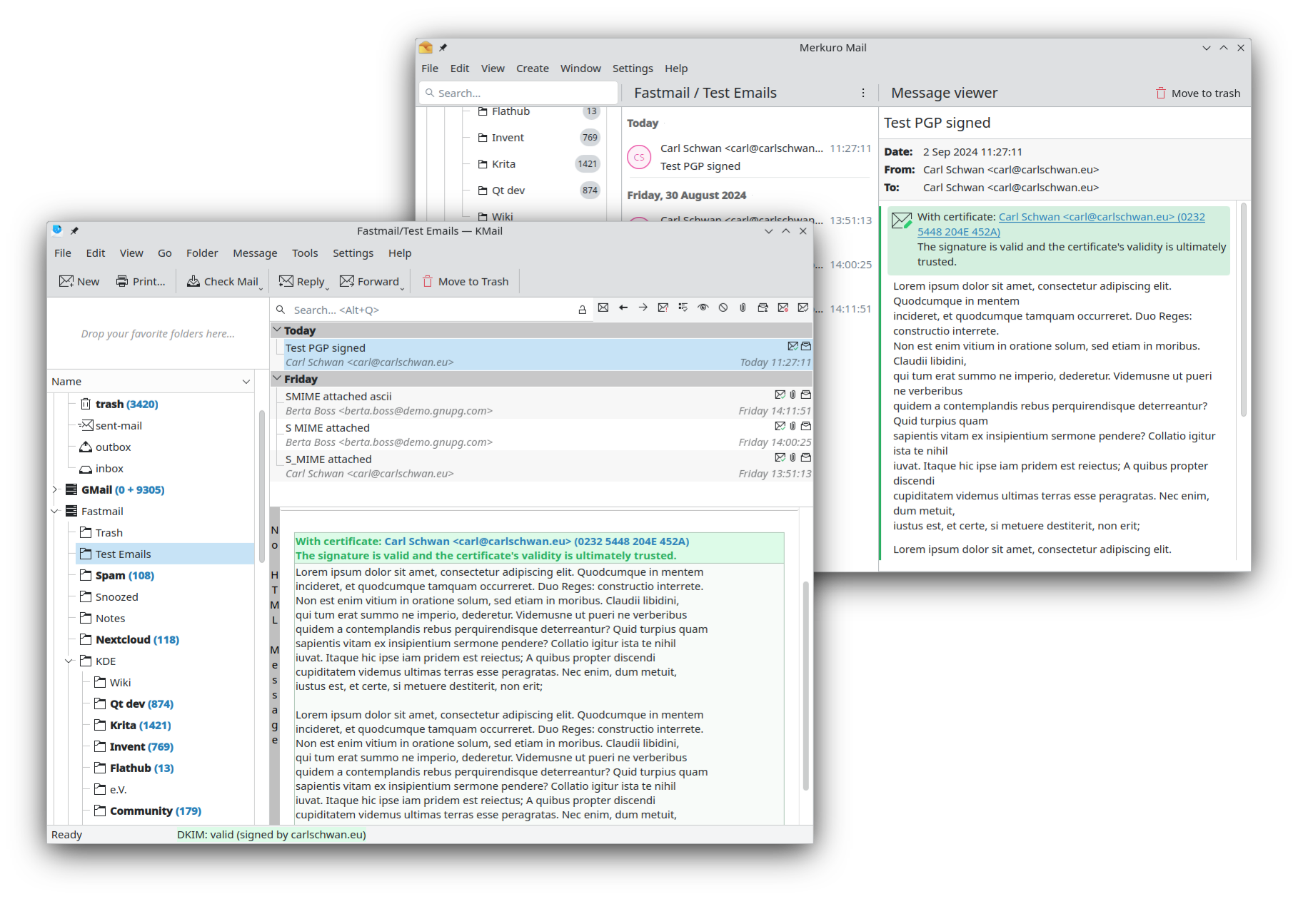
Always disliked in KMail that thin long hard to read switch-to-html/no-html button. It'd be magnitude better if we had as part of header switch-buttons:
[ Text ][ HTML Text ][ HTML no images ][ HTML with images ]
KDE
KDE is an international technology team creating user-friendly free and open source software for desktop and portable computing. KDE’s software runs on GNU/Linux, BSD and other operating systems, including Windows.
Plasma 6 Bugs
If you encounter a bug, proceed to https://bugs.kde.org, check whether it has been reported.
If it hasn't, report it yourself.
PLEASE THINK CAREFULLY BEFORE POSTING HERE.
Developers do not look for reports on social media, so they will not see it and all it does is clutter up the feed.
Been reported very often. Always gets closed as wontfix because of security concerns.
@kde @mykolak @kde@lemmy.kde.social It's a bit more complicated than that. There has been many bug reports about this already and it's a conflict prone subject even between KMail contibutors...
@carlschwan @kde@floss.social @mykolak @kde@lemmy.kde.social Quick hack to "hide" that bar: go into Kmail's custom colour settings, and change all the colour items for the HTML bar to the colour of your window. Bar still there, but completely "invisible".
It would be so much better, yeah.
