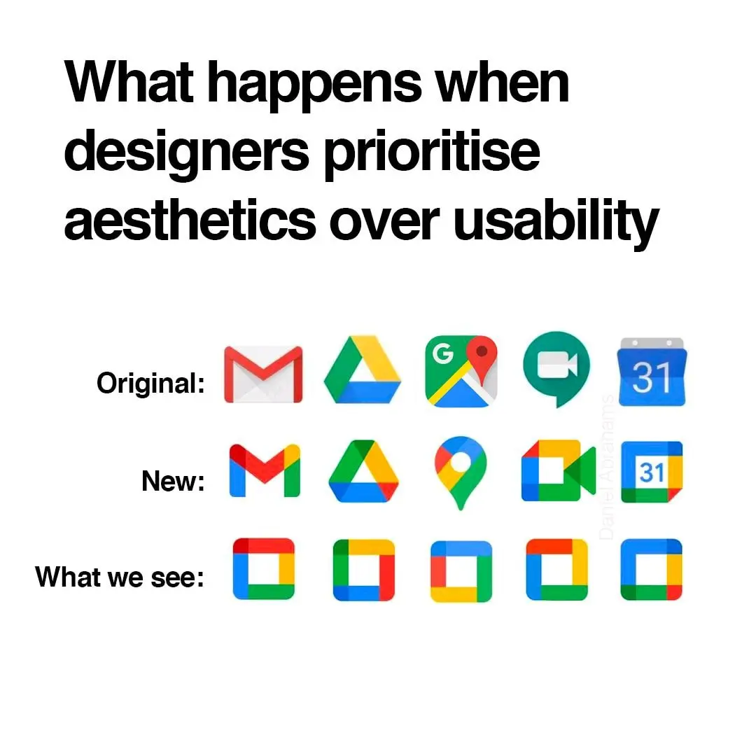
It's not even more aesthetic. Just more unified in branding.
Memes
Rules:
- Be civil and nice.
- Try not to excessively repost, as a rule of thumb, wait at least 2 months to do it if you have to.
And the interface of their apps are still incoherent af. I don't know how, but they manage to make things worse every time
Yeah, the old logos were all over the place. At first glance it’s not obvious they’re all Google apps.
And? All of those being part of the same walled garden is a bug in the legal system not a feature.
Better be explicit about the walled garden rather than being diffuse about it
To me, that's just the case for camera and calendar. Maps is IMHO perfect (except the unnecessary G) and the red-and-white envelope is quite well-known.
I think what really bothers me about the aesthetics is that the shapes are broken up by the coloration. For example, the pin icon for Google Maps looks almost like a hook, because the yellow has little contrast on this white background.
And that’s why I don’t really hate it. I hate Google, but I think it’s a neat design choice. I still hate Microsoft’s icon design a lot though, they can’t seem to stick with one thing.
I keep all my Google icons quarantined in one folder. Case in point:

I use nova launcher. It allows you to replace any app icon by any png file. So you can download the old icons from the internet and use them on your phone. It's a lot of work and I agree Google shouldn't have done this, but at least you can revert it if you want to put in the effort.
I also use Nova Launcher and had no idea you could do that! Thanks for letting me know.
Ugh… feels dirty to even have most of those apps installed.
Of those I have Gmail, Translate, and YouTube. I would get rid of those if got decent iOS alternatives.
Plus the art they started using in gdrive. The art on its own is cool but within the Google ecosystem just feels like… what is it even… why… ugh I hate it.

I am actually quite fond of this style, though this might be controversial
The homogenization of these icons has been a long source of consternation for me.
They're barely functional as icons; you can scroll right by them and miss them; which makes finding the apps in a list of apps a bit annoying sometimes. Removing each icon's unique color scheme and replacing it with the 'company 4 colors' was the stupidest fucking idea ever.
Even more infuriating is how they keep renaming the applications to unexpected things every so often; so they move around; and it's dreadfully annoying to remember if they prefixed the name of the app with a G or something else completely different, which renders strict alphabetical sorting a bit moot.
People simultaneously justifying their jobs but not willing to make significant, meaningful changes
Anyone else this there's actually nothing at all wrong with the "New" row of icons? Except for the triangle one, which is terrible in its "Original" version as well, as it indicates absolutely nothing about its app (I believe it's Google Drive, right?). All the rest are clearly distinguishable, and have relevance to what the app does.
The Google drive logo is even worse when you compare it to the play store logo which is also a triangle. I mix them up all the time
I’m mad that the Gmail icon is no longer an envelope, but other than that they’re fine.
What would happen if people deserted Google products in droves?
Mail:
- Vivaldi mail
- Android client: K-9 Mail
- Desktop client: Betterbird
Cloud:
- Mega [referral URL]
Maps:
Meet:
Calendar:
- Vivaldi calendar, syncable with a myriad of clients.
Here's an exhaustive list of Mostly excellent “free” software that I use.
Please also consider supporting the myriad of developers who offer their superior products for free, open source, without ads.
“What if I paid for all my free software?
I've always felt guilty by taking for granted the rare breed of virtuous humans that provide free excellent software without relying on advertising. Let's change that and pay, how much would I “lose” anyway?” —https://www.cynicusrex.com/file/takemymoney.html
Matrix is general-purpose chat. Meet will be replaced with Jitsi.
Also why not nextcloud for storage on someone else's computer.
Mega is shit
Sorry but no, MEGA is good. It's consistently rated among the best for privacy, performance and price. Imho Proton Drive is the best and most promising though.
Good if you use mega as your main cloud drive but bad for anyone else who got capped at 5gb and have to download inside the browser or use their app
Since Gmail doesn't have the obvoious envelope anymore I often open it when I want to open Maps. My brain ist like "M for Maps".
Not Google related, but whoever decide that the best color scheme for an Office suite should be light grey text on a white background deserves to be flogged.
I filed a very irritated Radar / Feedback (Apple's terms for bug reports) with Apple when the icons for apps all turned to rounded squares. I compared them to Google's icons and challenged them on making everything harder to distinguish.
I hate contemporary GUI design. Not all of it, but probably half.
What I keep seeing: $ $ $ $ $
Also I'm sure the designs are absolutely as humanly possible adapted to perfectly achieve their goal. Too much money, people, and time involved for this not to be the case.
And the goal was never ease of use, that doesn't bring in any more money when you have a monopoly. Engagement & forced ads do.
(By 'forced ads' in this case I do not mean directly advertising a specific product, but forcing you to pause your thoughts to specifically and consciously think about Google making the name/brand ever more part of your actual life and as such its shitty behaviour gets normalised, even trusted - thats just how our brains work even when we think otherwise ... and I hope we all think of Google as a curse on humanity.)
What's the font used in the heading? Is it some flavour of Helvetica?
It does not seem to have consistent kerning.
It certainly looks a lot like Helvetica. Probably could be any of these Helvetica clones:

I will also say that it feels a lot like Inter to me, which it's not as the i-dots aren't round, but maybe you'll enjoy that one anyways...
Man... I might be showing my age, but checking out some of the links in these replies gave me nostalgia for the website FontsnThings.com (or was it "FontsandThings"?). I used to love browsing that shit as a kid and downloading all the coolest looking fonts lol
Anyone else?
I just stopped using most of them
I stopped a time ago. Interestingly, the thing I miss most is maps. That sheer amount of user data paves the path for a fine traffic estimation.
Maps is indeed the odd one out. I'm trying to switch to magic earth, but it's not as good yet.
The absolute worst is the idiotic "let's make all app icons the same shape" thing.
There's always a yoyo effect with design. I fully expect Google to swing back to gothic palette and highly detailed icon within the next decade.
I use an icon pack on Android to revert them to their previous icon, the new ones are indeed terrible..
I like the new version of the last two, but old for the rest
Its one of those things u never think about as a person without disabilities, cuz i can tell the difference just fine, i guess they should have consulted someone with a vision impairment when considering stuff like this.
What do you mean, the new ones are still different shapes.
Color is the first thing the eyes tend to notice, then shape, then lines and details. The new icons all look the same at the edge of my vision, I have to look at them straight on to distinguish them. Individually each one is fine but together, like what the hell?
I don't rawdog Google icons anymore anyway, I use an icon pack
i see the new icons wanna intergrate googles colors ngl
To be honest the maps and the meets icons look better
For mostly all of my app-launching things I always prefer searching for text than searching for an icon. In pixel launcher, I always use the app drawer search, but an even better solution is in something like Niagara launcher.
One more reason to uninstall these app
