this post was submitted on 23 Jul 2023
445 points (100.0% liked)
Data Is Beautiful
160 readers
1 users here now
A place to share and discuss data visualizations. #dataviz
founded 4 years ago
MODERATORS
you are viewing a single comment's thread
view the rest of the comments
view the rest of the comments

Pie charts are useless in general.
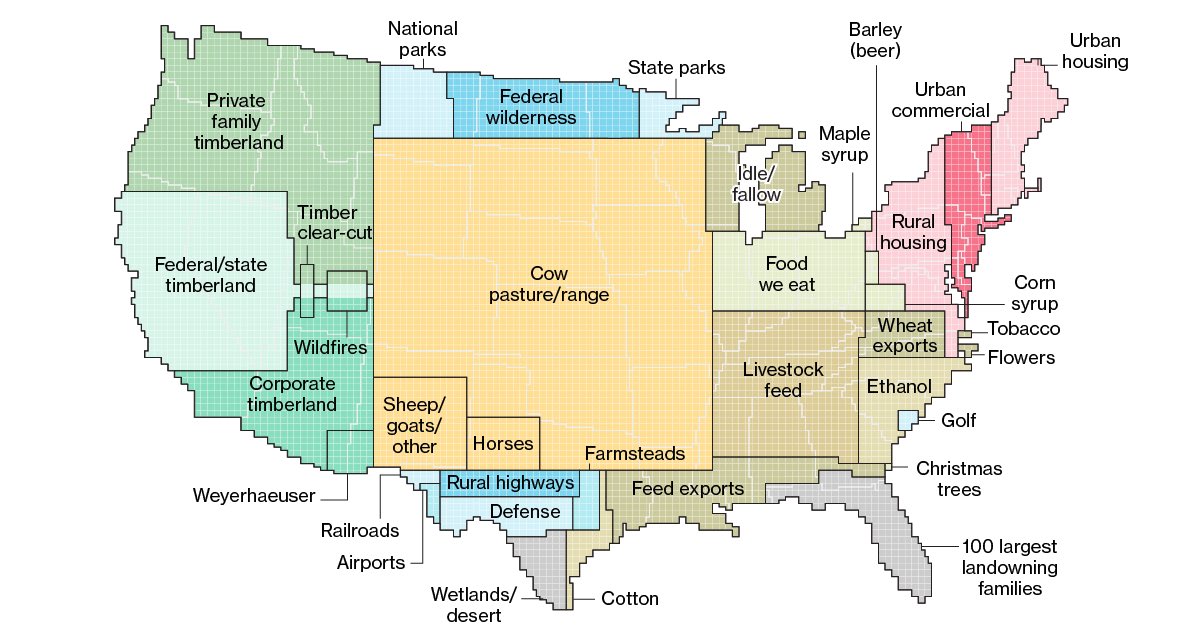
For the example shown here there are way too many categories for a pie chart. You would not be able to see anything past the top 3 or so categories as the slices get too thin and the labels would be all over the place.
Lastly you would miss out on the size comparisons to e.g. states.
This is much better.