Creative

4267 readers
1 users here now

Beehaw's section for your art and original content, other miscellaneous creative works you've found, and discussion of the creative arts and how they happen generally. Covers everything from digital to physical; photography to painting; abstract to photorealistic; and everything in between.

(It's not mandatory, but we also encourage providing a description of your image(s) for accessibility purposes! See here for a more detailed explanation and advice on how best to do this.)


Subcommunities on Beehaw:


This community's icon was made by Aaron Schneider, under the CC-BY-NC-SA 4.0 license.

founded 2 years ago
MODERATORS
201
30
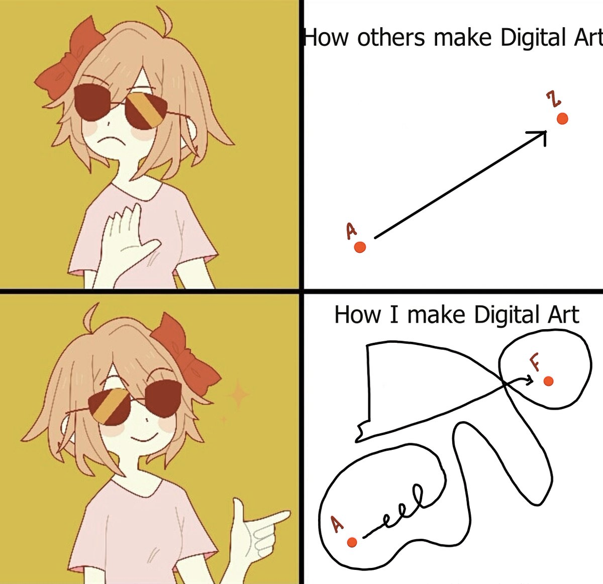
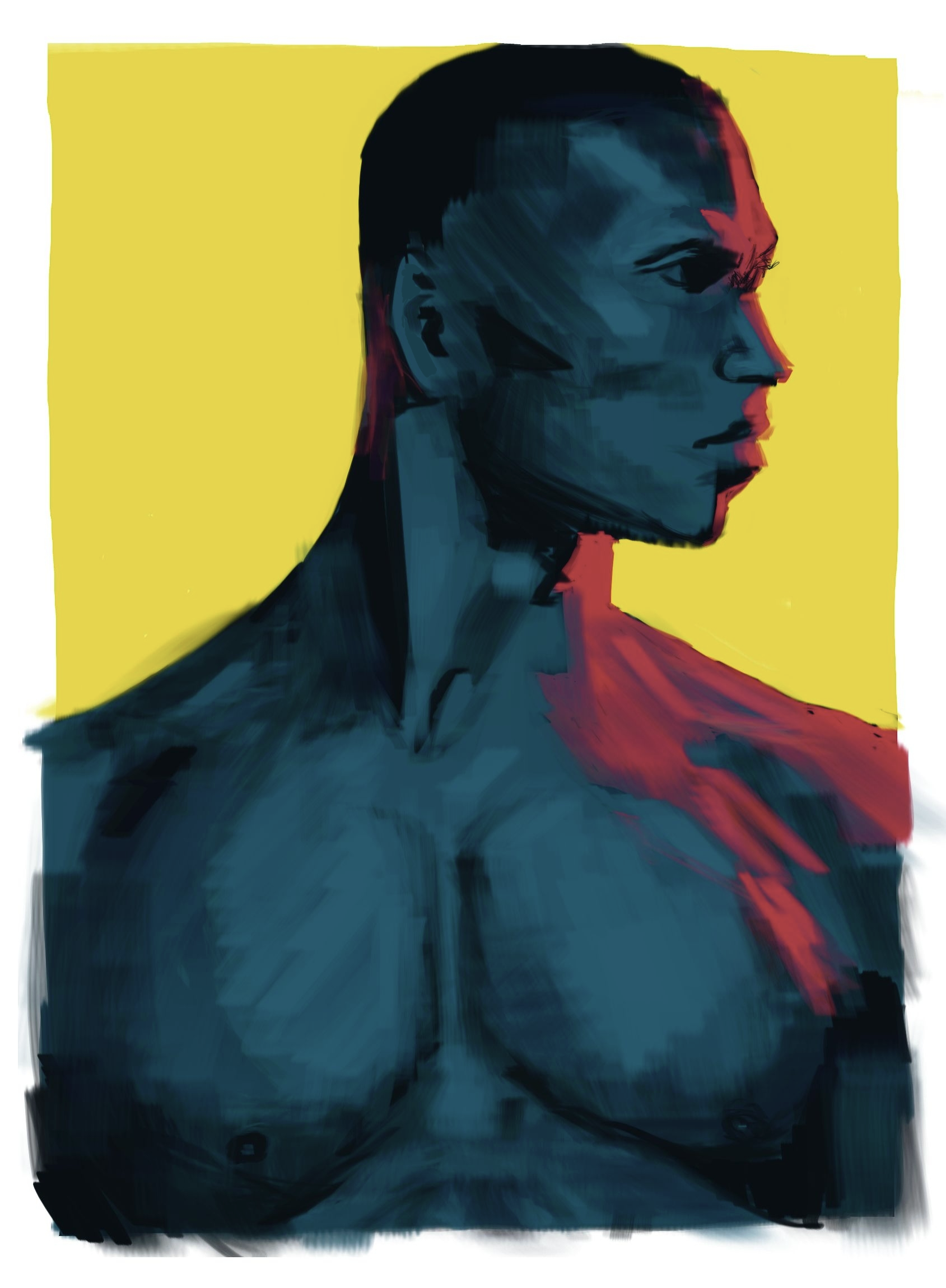
Krita best girl (beehaw.org)
submitted 1 year ago by voxov7 to c/creative
 
 
202
22
apprehension (beehaw.org)
submitted 1 year ago by voxov7 to c/creative


2022

203
32
Highlights (beehaw.org)
submitted 1 year ago by voxov7 to c/creative


2020

204
102
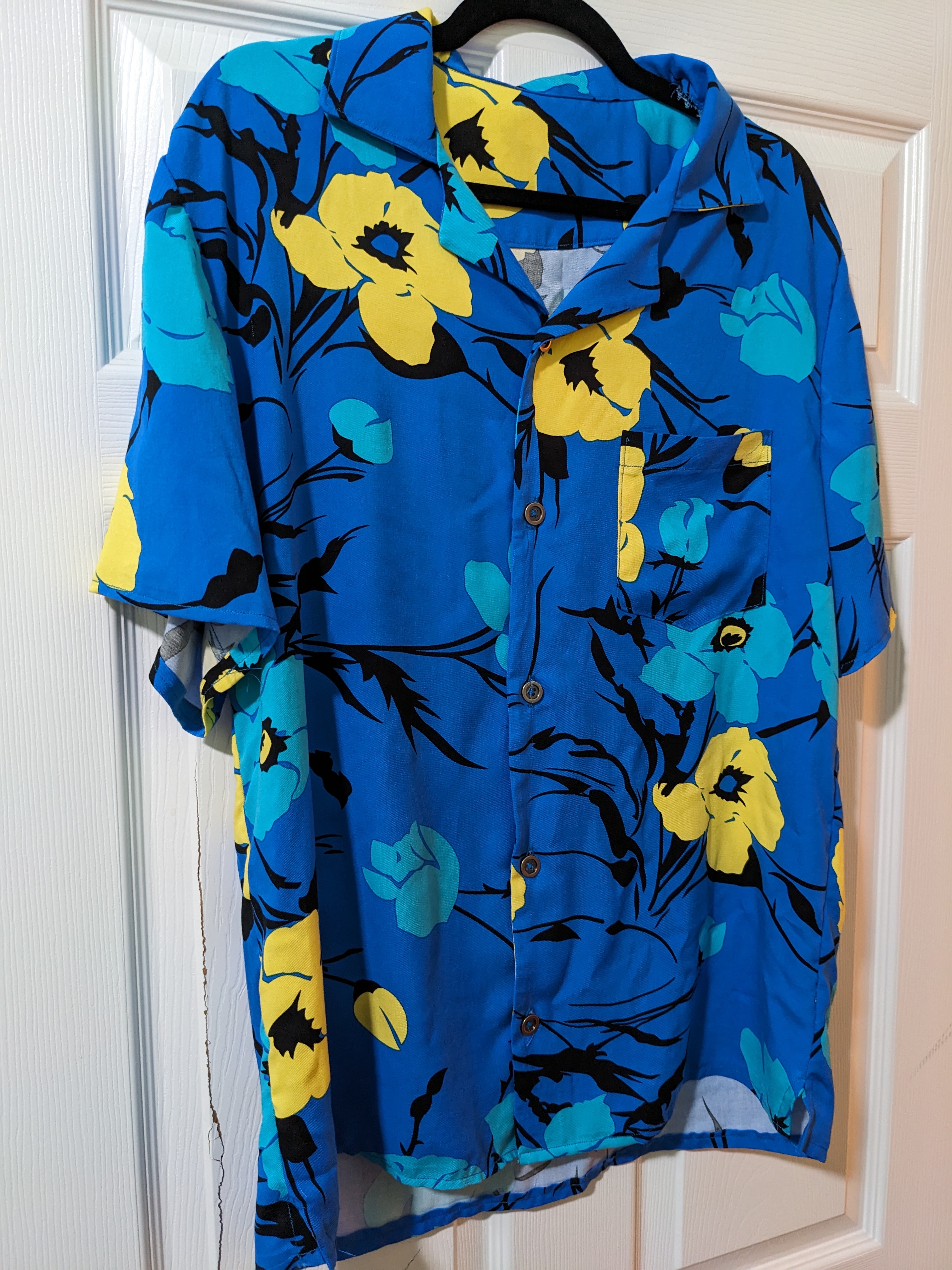
My fourth shirt (beehaw.org)
submitted 1 year ago* (last edited 1 year ago) by Cipher to c/creative


I like unusual shirts and recently took it upon myself and my wife's sewing machine to start making my own shirts.

I ran into this rayon challis in the fabric store and decided I should have a tropical shirt of it. Converting my pattern to accommodate what I've heard about rayon challis involved turning the side seams and arm seams into french seams (after adding to the seam allowance on the pattern).

Surprisingly, it fits perfectly. It's not perfect by any means, but it's the first shirt of this fabric type that I've ever owned.

205


Watercolor, ink and pencil

206
207
9
Supercuts (self.creative)
submitted 1 year ago* (last edited 1 year ago) by SeaOfTranquility to c/creative


This is meant to be one of those rabbit holes you sometimes find on the internet. If you are interested in movies and movie-making, you might be interested in this one as well. Like Alice, it depends on your curiosity if you actually want to fall down that rabbit hole or not. Anyways... I'm late... So if you're wondering what a rabbit could possibly be late for, you'd have to follow me I guess...

Just to be clear: I'm not talking about the song by Lorde, although I'm sure it was inspired by the actual thing. So what is a supercut then? According to Wikipedia: "A supercut is a genre of video editing consisting of a montage of short clips with the same theme. The theme may be an action, a scene, a word or phrase, an object, a gesture, or a cliché or trope." This means that a supercut is more than just a collage of random clips. It uses clips, to tell a new story. Often times it is used to show more meta-level aspects of movies but it could be really anything if you are creative enough. Most people have probably seen something that fits this description but If you are still unsure what it is, here are some of my favorite ones:

Now that we know what it is and what it can look like, the question becomes: Where can we find more of it? Well... you tell me... I'm always looking for new stuff so if you find something good, please share it with me here. There is a small subreddit for it and youtube channels like Now You See It or The Beauty Of make videos in that direction, but I'm sure there is much more out there.

208


For the last few years I've been using the Bear app on my Mac devices, but it hasn't been updated for a year, so I'm looking for an alternative.

What do you use to get inspiration and how? Do you collect inspiration at all, or do you doom-scroll through inspiration sites? If so, where? :)

209


Holy smokes, the photography in here is incredible. Look at the one the 16-year-old kid won with!

210


I'm starting to do penpals with a couple people. I drew a froggie and piano cat. I also will be doing a painting on the letter. So far I just have lines

211


cross-posted from: https://tabletop.place/post/2033

Recently been painting up Forest Dragon's Warmaster miniatures scaled to 15mm for custom scaled Frostgrave and Oathmark, and wanted to try out Army Painter's new 2.0 speedpaints, and I've been pleasantly surprised by the results! They dry a bit faster than I'd like, to the point of drying on-brush, but other than that, no complaints.

Still needs basing!

212


cross-posted from: https://tabletop.place/post/1473

I'm just a little excited about Halloween lol, any name suggestions?

213


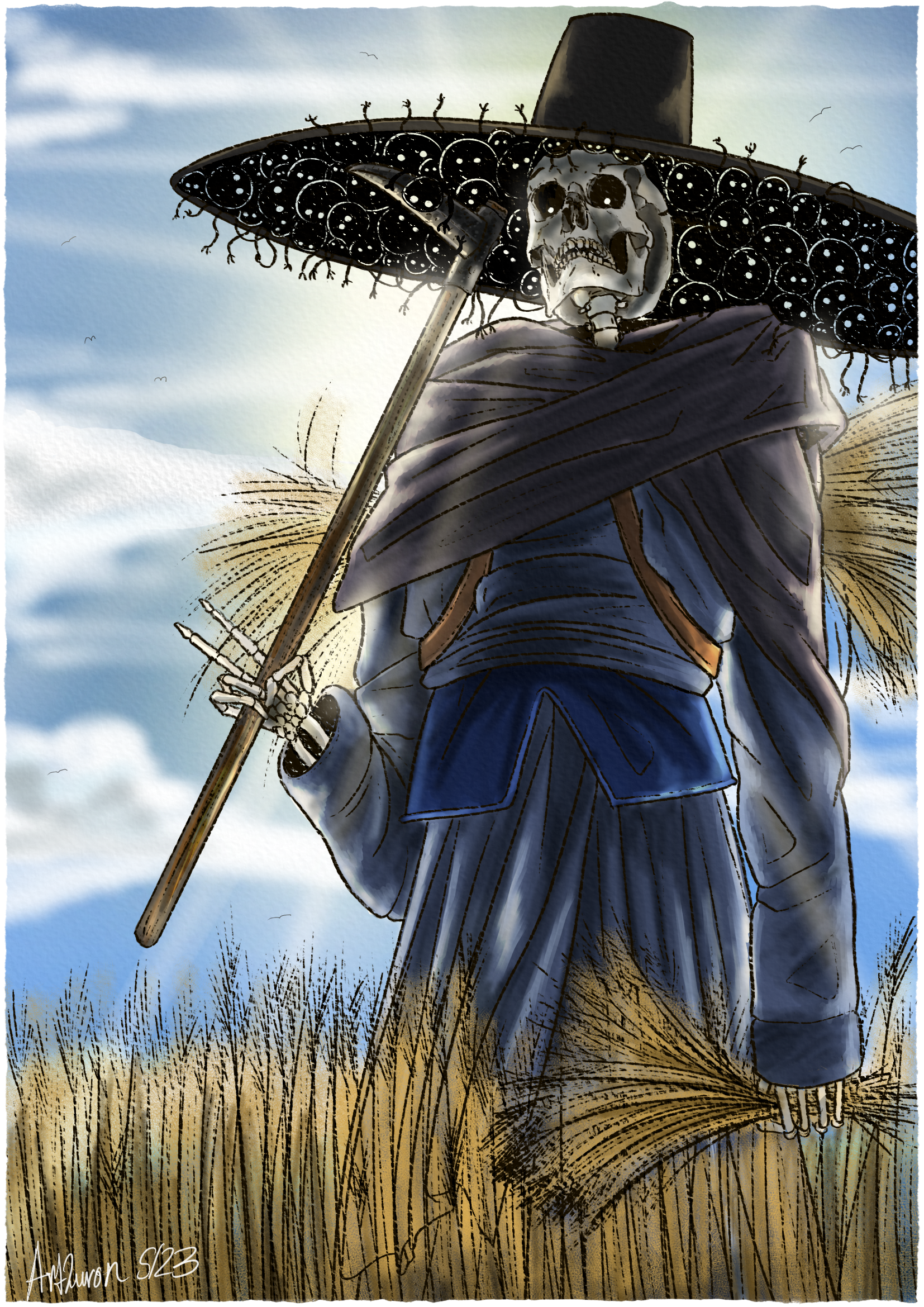
A piece a did in early may that I like. I am a big fan of neutral and benevolent depictions of reapers or Death, so I made this.

I'll be posting another piece later which I call "Destined Death" featuring a different version of Death entirely.

214
 
 
215


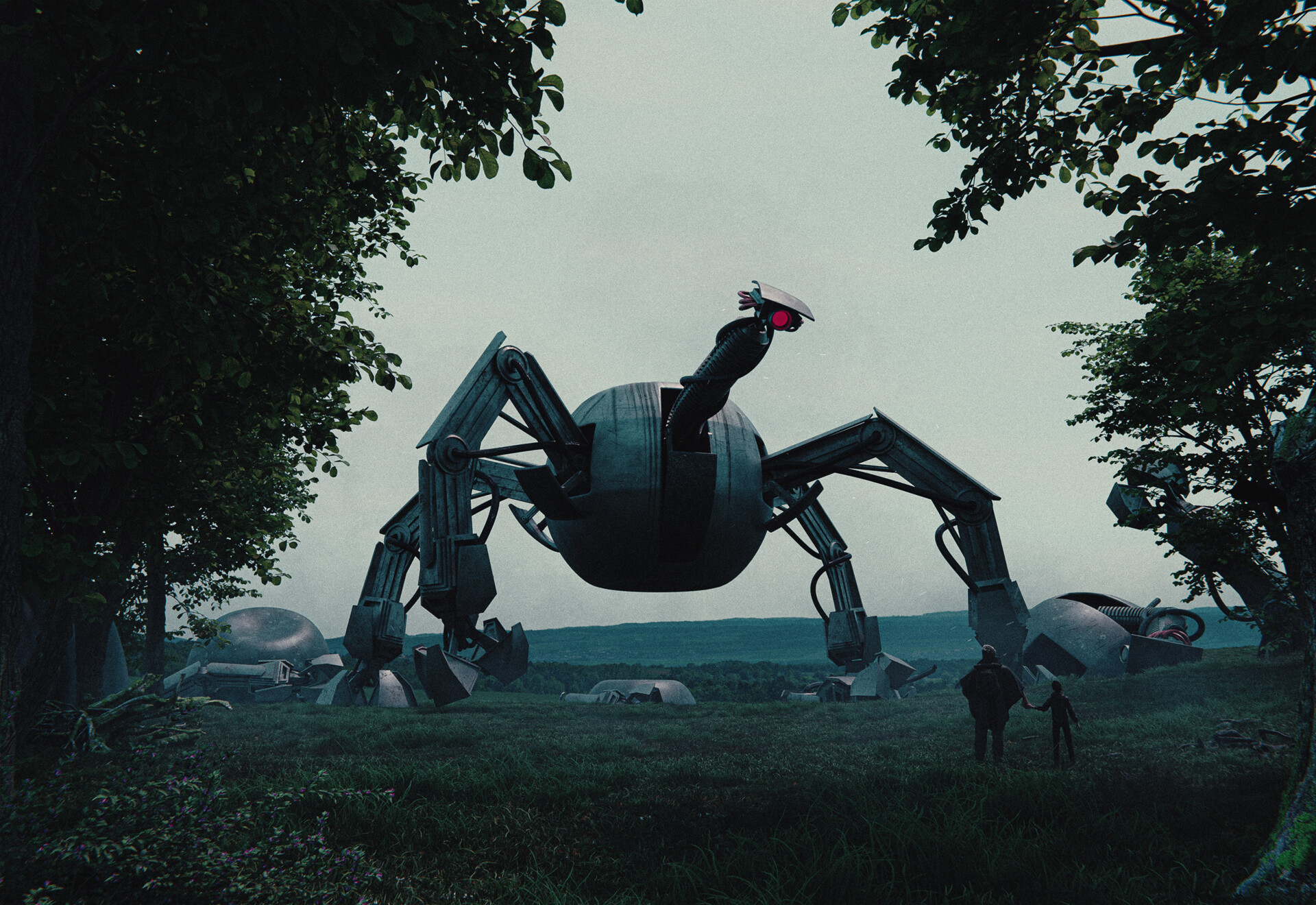
I’ve been learning Blender the last few months and I’m finally getting to a point where I can make the dark and moody Sci-Fi art that’s in my head!

216


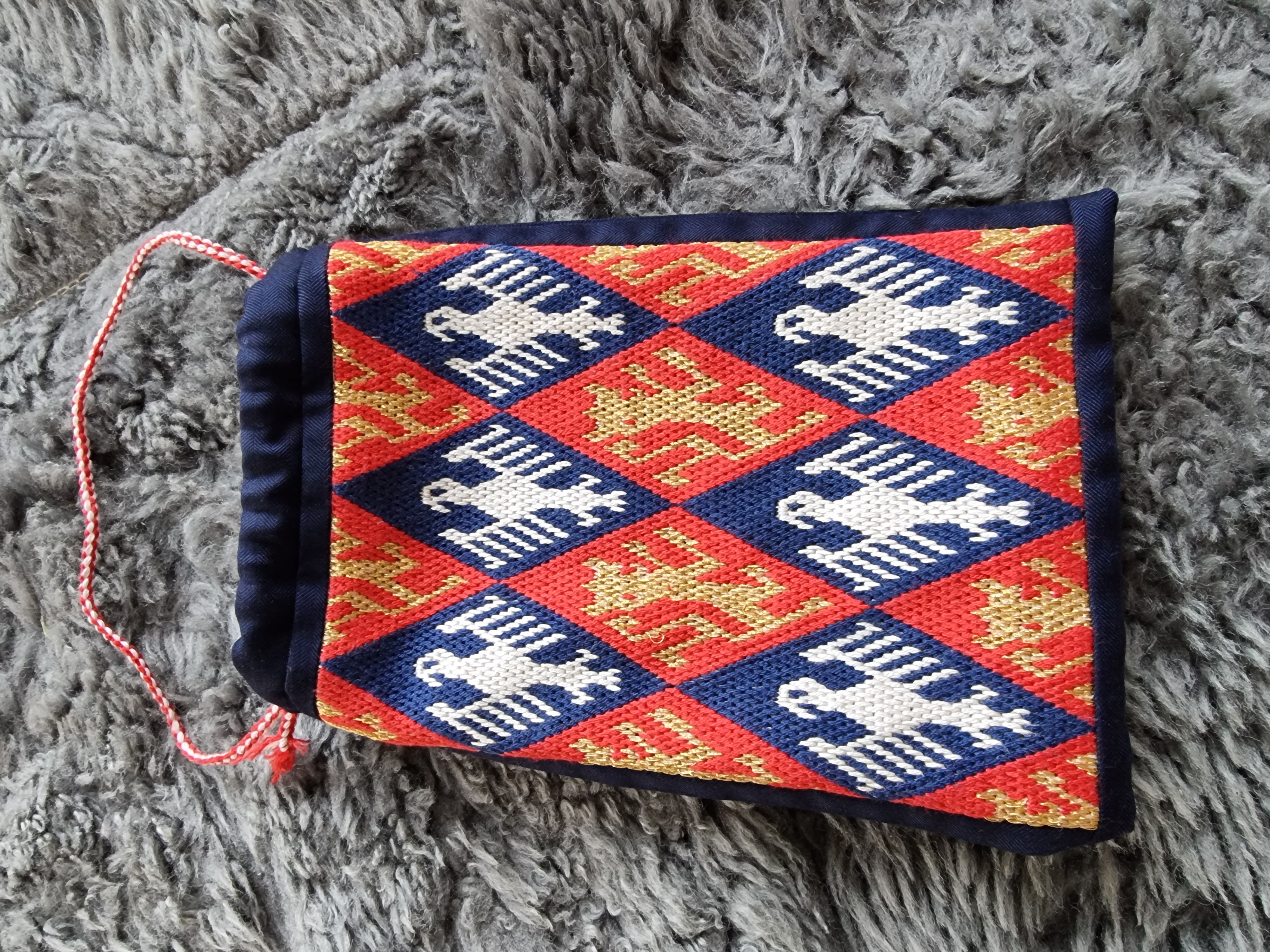
I embroidered and sewed an alms purse for my husband. The embroidery is done in silk and viscose on cotton and called German Brick Stitch, which originated in the 13th century. The rest of the fabric is linen. I got the idea and the embroidery pattern from wymarc.com.

217


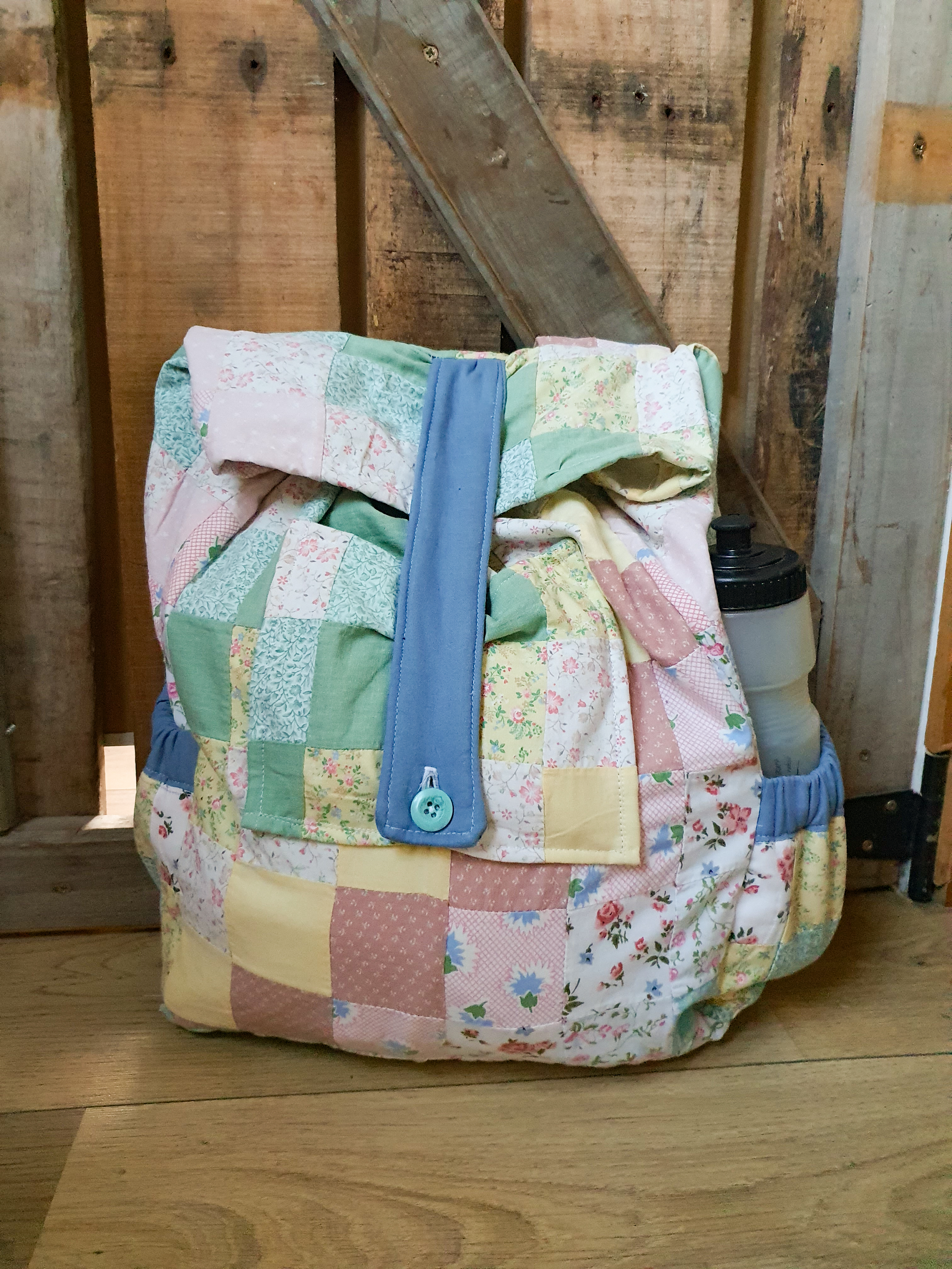
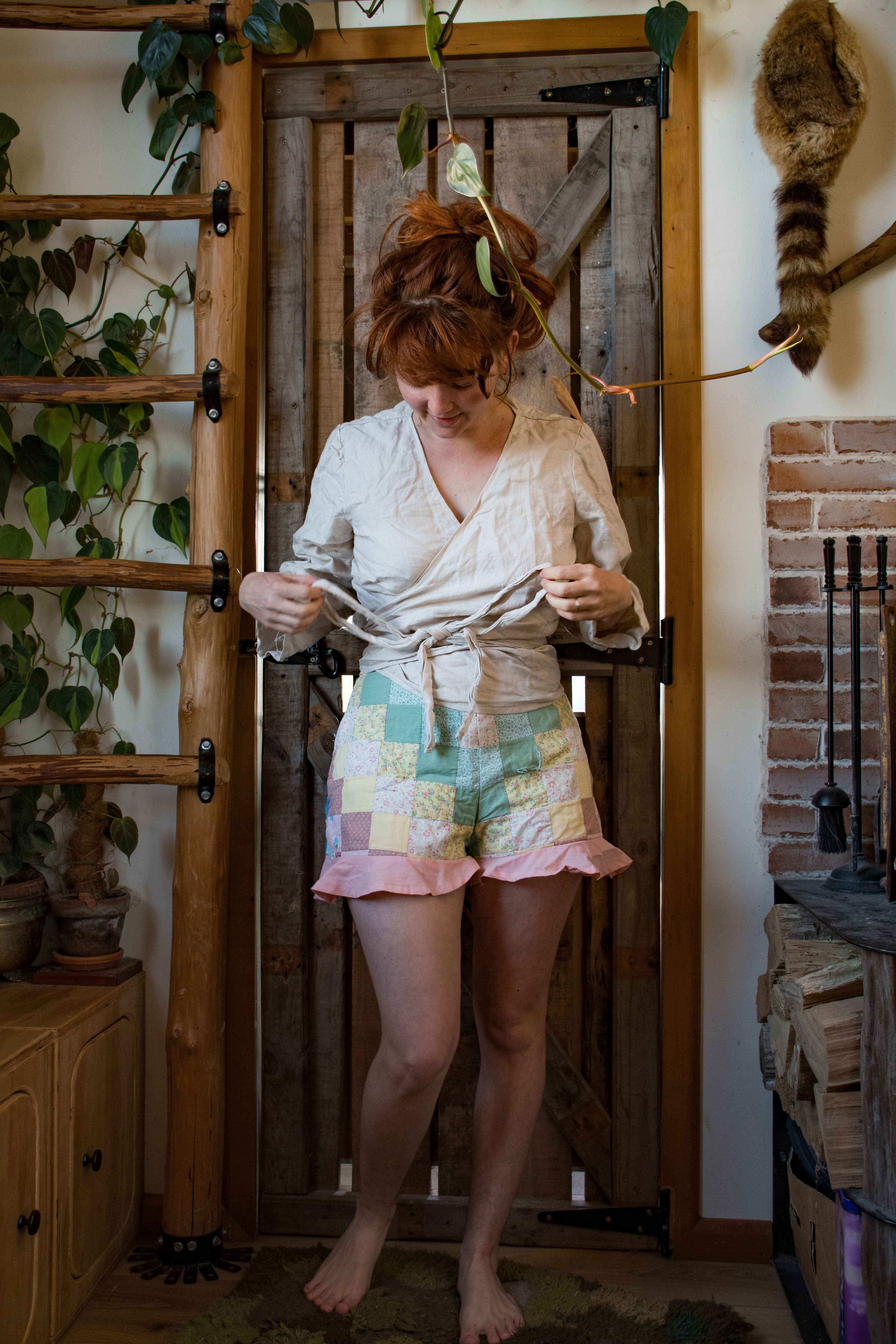
The top is linen and made with the (free) peppermint wraptop pattern and the shorts are made from a damaged quilt I found at a charity shop. I was also able to make a bag, pair of dungarees, and a hat from this quilt! I did add pockets to the shorts but these patterns didn't really need any altering. The bag is self drafted, just a slouchy backpack with a fron pocket and drink bottle holders.

218


I hate admitting defeat for anything. I loathe it but I just rage quit my test swatch of the Bixbite Shawl because I can't figure out the brioche. Never done brioche before so yeah, that's not helping anything here.

What project kicked your ass?

219
69
Alien lands (beehaw.org)
submitted 1 year ago* (last edited 1 year ago) by interolivary to c/creative


I've been going through some of my old photos, especially the ones I took in Svalbard ~5 years ago (probably longing for the cold now that it's >25°C here). I'm really pleased with how many of them turned out. Taken with a Canon EOS 800D, and mostly either a Sigma 30mm or a Canon 70-300mm.

I've purposefully posprocessed some of the landscapes so that they have lots of sharp contrasts and a sort of generally alien feel. I'm not quite sure if it's just too much, but personally I like the look.

Any sort of feedback is welcome, including criticism (just don't be an asshole, please.)

220
238
submitted 1 year ago* (last edited 1 year ago) by Sintamo to c/creative


Edit: I posted the first release of my theme based on the ideas in this post here!

Hi everyone!

I'm an Industrial/Product Designer in my professional life, and I was so inspired by @UrLogicFails's fantastic new community icons that I wanted to try out some of my own design ideas for Beehaw.

First, I tried my hand at an icon for Beehaw. I'm endeared to the little pixelated bee-cowboy we have now, but my background is in cleaner, more minimal designs that are easy to deploy to lots of different devices. A good logo sets a good first impression, and I want new users to see Beehaw as a real, legitimate alternative vision for social media. I've tried to recreate the back of a bee, and used the wings to form a subtle letter "B." My personal favorite is the ~~hexagon~~ bestagon, but I have both iOS and Android variations. Icon design is always really contentious, but it's also really fun - I'd love to see other people's ideas!

Second, I took a stab at tweaking the design of Beehaw, with the goals improving the layout and padding, introducing a more consistent color scheme, increasing legibility, and (of course) incorporating more bee elements. I'm working on a CSS theme that incorporates some of these changes, but others are beyond the scope of CSS injections and will require actual work on Lemmy-UI.

Light Theme:

Dark Theme:

I'd love to hear your thoughts, and I'm happy to share more if people are interested :)

Thanks for viewing, take care!

221


These themes are focused on reducing whitespace for all screensizes, make comment chains easier to follow, and aim to provide some variance from the default themes available on Lemmy.

These themes can be used with any extension that lets you inject custom CSS (such as Amino for Chrome and Edge).

For people making use of Stylus you can install the userCSS by going here, and choosing your theme and color scheme of choice in the userCSS preferences. Stylus makes themes like this a lot easier to use.

I've recently fixed some issues, and created a bunch of dark themes as well. Feel free to log any issues on the repo (including requests), and feel free to submit pull requests if you have any themes you've done that you'd like to add!

Just a note on light vs dark themes, the light themes are designed to work with the "Litely" theme in Lemmy's settings, and the dark themes are designed to work with "Darkly", so make sure to choose the applicable theme in your lemmy settings before applying one of the themes on the repo.

Special shoutout to @communist for the Ancom theme!

Here's an example of the yellow dark theme:

Yellow_Dark

EDIT: A note on Stylus, currently the userCSS only applies to beehaw.org, but you should be able to edit the theme to change which domains it applies to, for other Lemmy instances.

222


I keep trying to level up my drawing (weird and misshapen and also agonizingly slow), and so I'm starting again on this book. The transformations the author claims from their week-long workshops seem unreal and impossible-to-believe to me.

I remember attempting a portion of this book in high school, but I also remember quitting before getting half-way through. (And my "pre-training" drawings this time look distinctly untrained) At this point I think I'm putting off the next exercise because it just seems so big and long, and I have trouble focusing on drawing for a whole hour at a time.

223


Pattern is by Studio Ansitru

Finished this a few days ago. It's been on my WIP list since last year's pride, so it felt good to finish it during pride month this year.

Still needs a wash and framing (washing in warm water will erase the grid), but just happy to finally finish a WIP!

[Image description: A cross stitch of a screaming opossum, sitting in a flower bed of purple, pink, and blue flowers, holding a bi pride flag. The aida fabric has a faint grey grid woven in to the fabric itself.]

224


Made this as a Christmas gift to a friend.

225


Some art I made for someone on a Discord of her character having a nice cookout. She's a fire Genasi and wears fire-beetle chitin plates as armor. Her wildfire spirit is one such beetle, though smaller.

The landscape is based on a picture from Grand Canyon national park.

view more: ‹ prev next ›