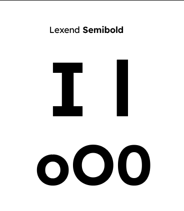
A typeface designed to aid reading comprehension, but with a single-storey a and a straight lowercase L? I don’t get it.
this post was submitted on 23 Feb 2022
3 points (100.0% liked)
Open Source Fonts
15 readers
1 users here now
A place to talk about free and open source typography, to show your discoveries or creations or to talk about anything else related to this theme.
founded 4 years ago
MODERATORS
A typeface designed to aid reading comprehension, but with a single-storey a and a straight lowercase L? I don’t get it.
Lower case "L" is different from upper case "i":

It also seems that dyslexic people prefer round lowercase a... though you are right for some it can be confused with the "o".
Lower case “L” is different from upper case “i”:
Next to each other they sure are different :) Didn’t know about the dyslexic people preference for round lc a… I just know it’s a no-no for legibility in general.