this post was submitted on 20 Jun 2023
33 points (100.0% liked)
Astronomy
110 readers
1 users here now
founded 2 years ago
MODERATORS
you are viewing a single comment's thread
view the rest of the comments
view the rest of the comments

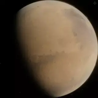
you can do minor variations in the layers, they can amplify the effect that its spinning, excited
I'd love to increase the color saturation and contrast (even though it probably wouldn't look as natural), but editing webp files is proving harder than making them to begin with. :(
This is amazing work
Thank you!