art

28 readers
1 users here now

Wecome to the art community of solarpunk, where we host any and all forms of art related to solarpunk!

Remember to follow the instance rules when interacting, and also:

-Cite the author whenever possible, or state it as unknown when unsure.

-This is an art community, for other aesthetic related things, check out our sister community /c/aesthetic.

-Keep it SFW.

Hope you enjoy your time here! :D

As a last thing, kindly reminder that solarpunk is not just a form of artwork/aesthetic, but also a mindset and a movemet. For more on this, you can check our community /c/solarpunk.

Icon artwork by tk-sketches

Banner artwork by 六七質

founded 2 years ago
MODERATORS
1
1
Radical Tenderness (www.apele.org)
submitted 12 hours ago by solo@slrpnk.net to c/art@slrpnk.net


A process | An encounter | A performance | A manifesto

Note: the Radical Tenderness Manifesto can be found in several languages here

2
3
4


Der Klimawandel trifft tendenziell die Menschen am härtesten, die am wenigsten dazu beigetragen haben. Gegen diese Ungerechtigkeit kämpft die globale Klimagerechtigkeitsbewegung – und es gibt ein paar tolle Bilder, die diese Bewegung greifbarer machen.

5
17
submitted 3 weeks ago* (last edited 3 weeks ago) by JacobCoffinWrites@slrpnk.net to c/art@slrpnk.net


I’ve been wanting to do more scenes of solarpunk ships. Shipping underpins a huge amount of our society and I think building a more solarpunk world will mean changing it in some really interesting ways.

Last time I did a ship in a storm, but I wanted to do something a little more bright and happy this time around. A month or so ago I was talking with a sailor on the solarpunk subreddit and I asked if there was anything they’d like to see in nautical solarpunk art. I was kind of looking for design ideas but what they gave me was better –an excellent list of experiences and details which stood out from their voyages, one of which was the way whales come right up to sail ships because they’re so quiet and the whales are curious. So I started looking for art of ships and whales to reference, and (of course) almost exclusively found of paintings of whalers killing and carving up whales (which put a kind of tragic tinge on that wholesome description of their curiosity). So I figured that was my next subject – I wanted to do a scene with a similar composition to those paintings, but with the ship very clearly hauling cargo, and the two subjects just sort of harmlessly crossing paths.

The trouble is that with a lot of ships (especially sailing ships), it can be hard for most of us to tell its purpose from a distance. Container ships are kind of the exception, so I started looking for the rare combination of sail ships that can haul containers, and sort of went down a rabbit hole as I learned more both about our current shipping and proposed designs. I ended up collecting so much information in the course of that reading that I’ve actually put together a second post just with information for solarpunk writers and artists who want resources for nautical solarpunk](https://slrpnk.net/post/14284744). I’m very much not an expert but I hope it hits the level of detail most folks need to get started and that it consolidates it nicely in one place.

By far the best luck I had with all that was in reaching out to the Naval Architecture subreddit, where I found a handful of folks with the patience of saints willing to answer my questions, provide all sorts of resources I’d missed, and who walked me through drafting this junk-rigged-cargo-ship-with-offset-masts design. I can’t thank Open_Ad1920and the others enough for all their help!

I’d started out unsure of whether I wanted to do a more traditional ship design to better match the old whaling scenes I was riffing on, or to lean in on some of the more modern concept art I’d found to better contrast it. I ended up taking the proposed windcoop container ship and changing it to follow recommendations from Open_Ad1920. They had a lot of interesting design ideas for a sail-based modern container ship and I basically decided I wanted to go all in on their dream design and see what it looked like, rather than copy a company’s concept art. I’m glad I went with a more modern design now, because I was able to make it look less sleek and more like a modern working vessel (with a paint scheme copied from some real life container ships). I think that reflects some of my goals in the postcard series of showing the less-pretty, industrial kind of spaces that underpin even a solarpunk society that tries to co-exist with nature.

Speaking of which, one of their recommendations was modifications to the hull of the ship to make it safer for whales. Whales are sometimes hit by ships (they sleep just below the surface and don’t know where human shipping lanes are). Some hulls are more dangerous to them than others. Ships with steep, sharp prows and bulbous bows are apparently especially dangerous for whales. If you search for ship hulls and whale safety, you’ll find an unfortunate number of photographs of a dead whale draped over one of those bulbs.

One of their suggestions was to change the prow of the ship so it was angled forward, with no bulb below the surface, and a much more rounded/blunt bowstem. This design will likely lose some performance benefits while underway but if it hits a whale I guess it’s more likely to sort of dunk them rather than to slam into them like an axe.

The notes post and this conversation go much deeper into some of the design choices, but there’s a few other interesting aspects to call out here:

As they explained it, cargo cranes aren’t as inconvenienced by masts as you might expect, but bridges built after the age of tall ships block a lot of important ports, so folding masts are necessary just to reach the dock. Junk rigs like the ones in the scene are apparently well-suited to folding and offer decent performance.

They also recommended placing the masts on the ship offset from the centerline, in a sort of zigzag pattern, two on each side. As they explained it, this gets more masts on the ship, without going extra tall or messing up each others’ lift over drag ratio. I’ve poked around and found a few examples of offset masts (on flat bottomed boats, proas, or catamarans) but not much like this.

Most of their other suggestions for reducing draft and maintaining control underwater are hidden by the ocean. To paraphrase their suggestions, "the vessel has either a lifting keel or daggerboards. It also has at least two rudders, if not more, to get sufficient area. The rudders might end up as transom-hung folding types to reduce draft and maintain good performance under sail. A long, thin rudder works best. Racing monohulls of all sizes have been built this way and they work well while avoiding rudder damage from impacts."

The whales in the foreground are blue whales,just sort of swimming alongside.

6
7
8


Created by /u/joan_de_art on Reddit.

9
 
 
10


I’ve been wanting to do scenes of solarpunk ships and shipping for awhile now. I love reexamining old technologies and seeing if they could work again, mixed with modern advancements, especially in a society with different values, or one that uses more metrics than just money to make their decisions.

I’ve read about the various attempts to make container ships more green with massive sails and kites and alternative fuels, but I never really loved any of them enough to make art of them. At best, they seemed to promise that they might use somewhat less fuel in the future, but they seem committed to the basic container ship format because its so efficient (in cost) and because everything is optimized around it.

I was talking with some of the folks from Fully Automated! about future weather changes, megastorms and tsunamis (and the potential for tsunamis to set off undersea avalanches that cause more tsunamis) and the damage those could all do to ports. How all that carefully-optimized equipment, even the depth of the ports themselves, could be damaged suddenly.

I started to think about solarpunk ocean scenes again, and about smaller vessels (which could perhaps use the shallower ports) could operate largely by wind, more or less traditionally.

Can the concept of container ships fit solarpunk? I genuinely like the optimization and logistical advantage of using standardized, stackable shipping containers which fit on ships, trucks, and trains without the need to load and unload the cargoes by hand at each transition in their journey. That’s great stuff, no complaints. What I wonder about is if that cost efficiency has caused other problems. We ship cargo all over the world but much of the time, we do it because it’s so cheap to do so. We ship raw material from one continent to process it on another, we ship that material again so we can shape it into parts, which are shipped back to the second continent for partial assembly, and then for final assembly on a fourth. Is that efficient? It’s cost efficient. But we burn terrible amounts of fuel each time we do it, and we do it for so many things.

So I’m skeptical.

Alright, my complaints out of the way, what’s actually in this scene? We’ve got an offshore windmill and a steel-hulled, four-masted barque with what’s hopefully an open-source variant of DynaRig sails.

So what does that mean? I’m very much not nautical – as with most of my postcards I’m doing my best to combine a bunch of concepts I’m only newly familiar with, so I’ve tried to make sure they’re at least based on reasonable starting points:

Cromlyngames in the FA! team mentioned DynaRig sails, these kind of funny-looking sails that taper towards the base, with thick masts and curved yards. They’ve seen some limited use on expensive yachts, there’s some proposals/plans to use them on container ships, and do seem to work well from what I’ve read. Their main advantage is in labor-savings and safety – the sails apparently slide out from inside the masts following tracks in the yards, so nobody has to climb the rigging to raise or lower them. And the entire mast rotates to best catch the wind. This allows for a smaller crew, and less of the traditional risks.

Crom suggested that they could work with any square-rigged ship, and a quick perusal of some nautical and sailing forums agreed with that (and taught me what those were). I started reading about traditional maritime shipping, and eventually found a forum discussion about the potential return of sail to modern day shipping. A poster on there mentioned the Passat, a German Flying P-Liner, and I was delighted to learn that a whole set of steel-hulled sail ships were hauling cargo well into the 1950s. Heck, one of them was captured by New Zealand during WW2 and put right into service hauling construction supplies.

So I borrowed the hull. IRL, I’m sure there’s a ton of quality-of-life improvements ship designers and sailors could suggest for a modern barque, and I’m sure I’ve included some stuff that doesn’t belong, but I’m just happy to have found a sail ship that was still effective in fairly modern days. In fact, it looks like staffing (both the difficulty finding qualified crew, and changing laws requiring more crew than traditional) was a big factor in the end of their service, and that’s something I suspect the modernized sails could help with.

I’d like to do more nautical scenes, so if you have improvements or alternative designs, let me know! I think I might do one with an offshore windmill substation, a clipper ship, or anything else you think would be worth showing. I know there’s been a ton of tech and safety features invented and added to ships since the P-Liners were modernized, and I think those things could help shorten their journeys and improve their safety at sea.

Art stuff: usually, unless I already have a strong plan for the visuals, part of my research is looking up various real life postcards and other art of similar content for inspiration. People have made postcards of almost everything.

There’s no shortage of paintings of ships at sea – I started this as a peaceful, sunny scene, but eventually gave in and went for a dramatic storm instead. Maybe showing the ship in a storm weakens the point a little, but ships run into bad storms even now, with all our modern day early warning systems – you can see plenty of videos online of even massive container ships losing cargo from being heaved around by the weather.

And one of my goals is to show weather, seasons, and locations that Solarpunk art doesn’t often feature. Bad weather is a fact of life, and it’s likely to get even more wild as our climate changes. I’ve done a couple scenes of blizzards, but none of terrible rains yet.

Given the premise that this is a postcard from a solarpunk future, it might be a historical scene of a famous ship that survived a hurricane, perhaps in the moments when the storm blew it dangerously close to an offshore wind farm.

This image (and all the other Postcards from a Solarpunk Future) is CC-BY, use it how you like.

11
12


It’s been a little while since I posted one of these. I’ve been working on writing a campaign(?) adventure module(?) For the solarpunk TTRPG Fully Automated (which I’m hoping to release libre and gratis through their channels in a few months) and that’s taken up a lot of my creative time lately. It’s the first piece of solarpunk fiction I’ve written, and it includes almost every setting concept I’ve been playing with in the postcards.

(In case you’re wondering, it’s a sort of treasure hunting adventure, where the players are on a quest to find several tons of illegally-dumped industrial waste, which is useful in the production of geopolymers. Through their investigation they’ll explore a mostly-abandoned town which is in the process of being deconstructed and rewilded, talk to locals and work crews, and hopefully unravel a cold-case murder mystery lost to the region’s chaotic past during the setting’s Global Climate War 60 years before.)

Either way, I’ve gotten far enough along that I think I can start photobashing together some art for some of the locations the players might decide to visit (starting with this bike kitchen in the village where the game begins).

In my postcard about deconstructing McMansions to reclaim the building materials and rewild the land, a few people brought up simply repurposing the buildings. I’d been batting around the concept in my head for awhile before then, but had struggled to figure out how to render a scene that showed everything I wanted it to.

I ended up using pretty much every idea I had for those scenes in the campaign’s starting village (a planned community which has repurposed an abandoned wealth enclave and its golf course as communal housing, workshops, and a food forest. That means I can put together photobashes of specific spots within that village, which I think is more achievable.

So here’s the first of the set. It shows a little bit of a repurposed discount mansion, but focuses mostly on the old back yard. The concrete patio has been removed, the large lawns and nearby golf course have grown into proper forests, and public paths have been brought right up to the house. The pool house has been turned into a bike co-op, and the swimming pool has been converted into a sunken greenhouse or Walipini.

Generally when you end up with an old swimming pool you don’t want, your options are to tear it out and fill in the hole, just fill in the pool, convert it into a natural pond, or (perhaps the least common answer) build one of these. Which one you pick will likely depend on your goals, the quality of the structure, and how far down your water table is. If it’s too high, it can lift an empty pool like a concrete boat, or cause other structural damage. But if circumstances are right, and the pool is intact after being abandoned and empty for a good many years already, it might be worth repurposing.

There are some beautiful and solarpunk photos online of real life versions of these, which have a far grander scale than what I’ve depicted here. This is more like the old pineapple pits, or a fancy version of the citrus trenches. Who knows, maybe they even cut away part of the floor so they could plant into the ground below.

The above-ground portion of the greenhouse is backed with an earthen berm/raised bed meant to help it maintain a consistent temperature. The retaining walls of the tiered bed are made from repruposed, broken-up concrete (sometimes called urbanite), likely sourced from the concert patio which was replaced with wood chips for better water permeability. Some full-shade plants like rhubarb and mint have been planted on the back slope, and a grape arbor has been built over it. Sweet peas are growing along the side where there’s more light. Raspberries and wildflowers grow around the rest of the smaller yard space.

In the background of the scene, an old pool house has been converted into a bike kitchen, one locations where the players will be able to obtain transportation.

A network of paths have been built all throughout the village, the food forest, and the region beyond. Even the town the players will explore is riddled with small trails and paths which the locals have built in lieu of trying to maintain a full network of paved roads. This was inspired by my hometowns' network of backwoods trails, and the downsizing to achieve a maintainable transportation network described in this article. Some roads obviously still exist because they're useful, but others have been washed out and never repaired because none of the current residents need them for anything, while new trails cut straight through properties nobody has lived in for decades.

The buildings are painted with colorful murals. This is always a challenge for me in these photobashes. I love the idea of a society that makes art everywhere for its own sake and I'd hope a solarpunk society would abandon some of the obsession with property values and would decorate everything from buildings to machines, in all kinds of styles. That might mean folk art with historical roots, like the zapista murals, it might mean carved panels on cabinets, or etchings on tools, metal sculpture, or who knows what. Embellishment not for commercial value but as self expression and messaging. So the topics and content would vary a lot.

I think there's a bit of punk in that, in refusing to paint or decorate with an eye on the resale value, like your house is a product for others rather than your own home.

So I try to include murals, carvings, and other decorations in my solarpunk art. Unfortunately I've also found that in my postcards, where the buildings are usually part of a cluttered background, murals can kind of act like dazzle camouflage, making it hard to tell what exactly is happening. So I'm still figuring out what works and what doesn't. (Ideally, I want the contents of the mural to be clear while also allowing for the building and the assorted stuff attached to it (plants, solar panels, other tech) to be easily recognized and understood. It's challenging and something I might revisit someday. I did try a version where the bike kitchen's mural was made out of silhouetted bike parts, but it looked less obviously like a paint job on a building, so I went with the mandala for clarity for now.

Edit to add: this photobash (and all the Postcards from a Solarpunk Future) is CC-BY, use it how you like.

13


Vietnamese translation of "Oh Rascal Children of Gaza" by Khaled Juma, by Hoài Phương, who is the admin of FB page Thơ Palestine. You could find the English version here

Thơ Palestine is the FB page with the mission of preserving Palestinian poems and translating them to Vietnamese, but you could also follow them for updates on Palestinian families and people that various FB pages are currently fundraising.

The picture is a part of a collaboration project between Free Watermelon Now, Thơ Palestine, and Steven Quốc Võ. There is a video with Quốc Võ's voice narrating the English version of the poem over the illustration. You could see it on Free Water Melon FB page.

Follow them at:

Thơ Palestine on FB

Free Watermelon Now on FB

Steven Quốc Võ on IG: @thgquoc

14
15
16


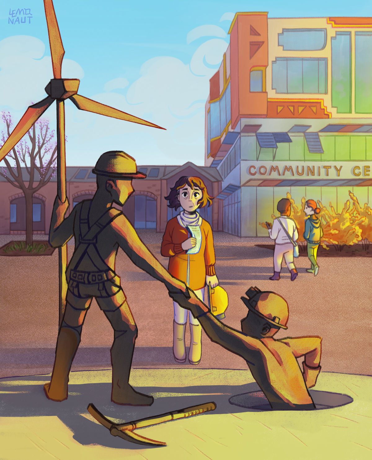
"A community center initially set up to help coal miners respecialize and find other jobs, now became a place for unofficial 'pilgrimages' of people striving to find their role in life and learn the history from those who lived it."

The "community center" solarpunk writing prompt got illustrated by the awesome Lemonaut ! As always, I'm incredibly impressed with their art.

You can listen to the podcast episode about it at https://podcast.tomasino.org/@SolarpunkPrompts/episodes/the-community-center

I think what the Lemonaut does here is the essence of solarpunk : very intentionally creating new visual and narrative symbols we need to tell stories about our future. No AI could create such a vision.

I love how this one mixes the mundane prospects of looking for a new profession, identity, with the Solarpunk hope.

If you like their work, you can support them at https://www.buymeacoffee.com/thelemonaut and read more of their art, including the (recently trending) Solarpunk Story, at https://www.tumblr.com/the-lemonaut/710271433164668928/thats-why-im-looking-into-solarpunk-and-am

17
18
19
20
17
submitted 4 months ago* (last edited 4 months ago) by MrMakabar@slrpnk.net to c/art@slrpnk.net
21


Original designs done by u/555i and u/roguecache (on reddit)

Combo created by u/CombatantWombatant.

22
23
 
 
24
25
36
Planted A (slrpnk.net)
submitted 5 months ago by poVoq@slrpnk.net to c/art@slrpnk.net
 
 
view more: next ›